
Icon Set
headphones tv iphone chapstick arrow game controller

An AI icon generator that turns a style reference and a short description into one cohesive icon set image.

Brand Icon Systems
Designers use this icon maker to quickly generate icon sets that match an existing brand style, providing a starting point for UI and marketing icon libraries.

Presentation Graphics
Marketing teams run the technique to create styled icon sets for pitch decks and presentations, ensuring visual consistency with their brand materials.

Website & App Design
Product designers use this app icon generator to prototype interface icon styles, using a reference image to maintain design language consistency.
How to use Techniques?
Discover how to utilize Icon Pack for different scenarios.
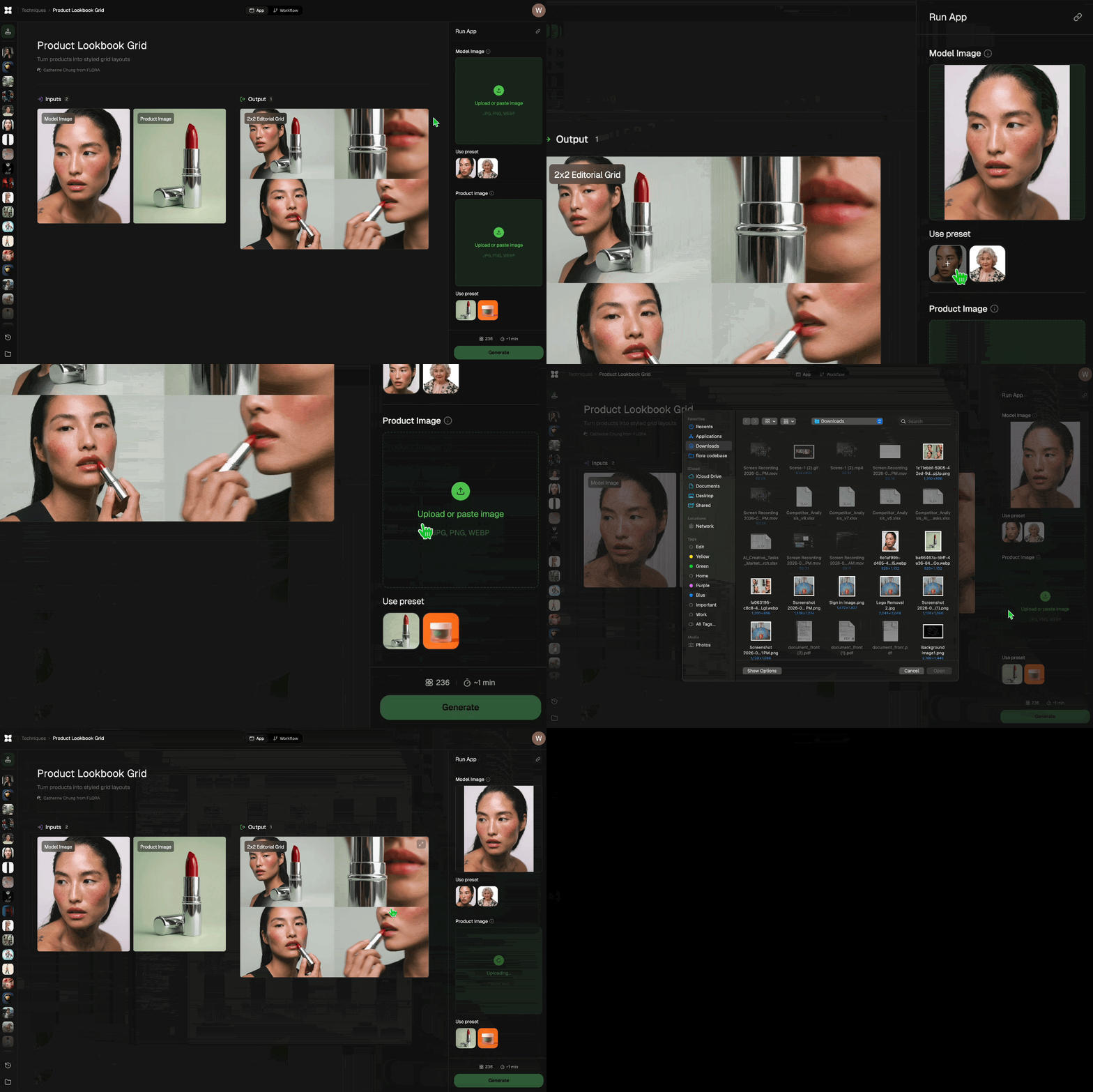
Add inputs
Upload images, videos, or type in the prompts to get started.
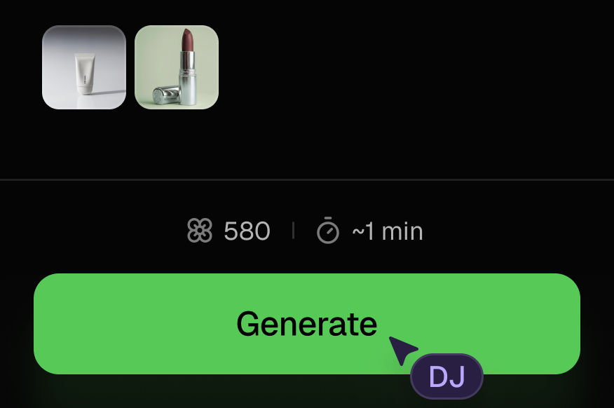
Generate outputs
Next, hit the "Generate" button to start generating your outputs.
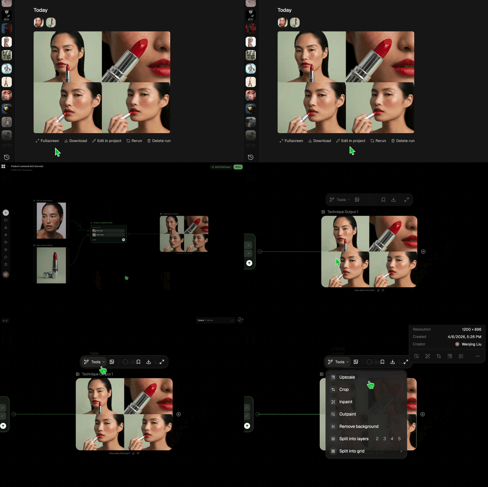
Edit and export
Refine your outputs on canvas, or download them directly.
Frequently asked questions
All you need to know about Icon Pack
What an icon maker is actually doing when it builds a set
An icon maker takes a style reference and a list of things you want drawn, then returns a set where every icon obeys the same visual rules. Any competent designer can draw a pair of headphones in an afternoon. The work is drawing headphones, a TV, a phone, and a game controller so they look like they came from one hand.
The outliers are what people notice. One icon with a heavier stroke, one with a rounder corner, one drawn at a slightly off angle, and the row reads as borrowed clip art. Try it with your own reference.
The rules that make a row of icons look like one family.
Most of it is mechanical. Six things have to match:
- Stroke weight stays identical at the same size, inner details included.
- Corner radius applies the same way to every terminal and joint.
- Grid and keylines keep a square, a circle, and a tall rectangle feeling equal in weight even though their areas are not.
- Optical balance, not geometric centering. A triangle centered by math sits off center to the eye.
- Level of metaphor holds steady. A literal camera beside an abstract cloud beside a skeuomorphic folder reads as three different sets.
- Perspective is one decision, flat or isometric, applied across all of them.
Most sets that feel wrong are failing on the last three. Stroke weight and corner radius are easy to eyeball, so they get fixed. Metaphor level slips quietly, usually because the icons were made at different times by different people. An icon maker holds all six constant by default, which is the real argument for generating a set instead of assembling one.
How an AI icon generator reads a style reference
An AI icon generator reads your reference for properties, not content. Stroke weight relative to icon size, corner treatment, fill versus outline, how much depth sits in the shapes, palette, perspective. Those get applied to whatever objects you name in the list.
So the plainest reference usually gives the best result. A screenshot of a finished interface carries type, layout, and background color along with the icons, and the model has to work out which parts you meant. A tight crop of six icons on a blank field carries only the icons. If the reference does not exist yet, build it first with FLORA's AI image generator and feed the result back in.
App icon generator vs. interface icons: two different jobs
An app icon generator and a UI icon set solve different problems, and one style rarely covers both. The same icon maker can produce either, but the reference you hand it should match the job.
An app icon is a single mark on a home screen competing with everything else installed. It usually carries a background, some depth, and a saturated color, and it has to survive scaling from a store listing down to a notification badge. Detail that reads at full size vanishes at that scale, so app marks stay bold and simple.
Interface icons carry different constraints. There are dozens of them, they sit beside text, and they should never out-shout the label next to them. They stay mono-weight, unfilled or lightly filled, and they take color from the theme instead of owning one. Recoloring a finished set for a dark theme is its own pass, which is what image recolor handles, and dropping the set into a layout with wireframe is the fastest way to see whether the weight holds up in context.
The rest is production. Raise the resolution with the image upscaler before anything goes to print or into a large-format deck, or push one mark further into a sigil when a single symbol has to carry the brand alone. On FLORA's canvas the reference, the set, and the layout sit side by side, so revising the reference means regenerating the set in place instead of rebuilding the file.
Related techniques
 Material 3D Logo Render EngineUpload a logo, get it rendered in 3D across a set of materials.
 Mood Board MakerEclectic mood board from a photo
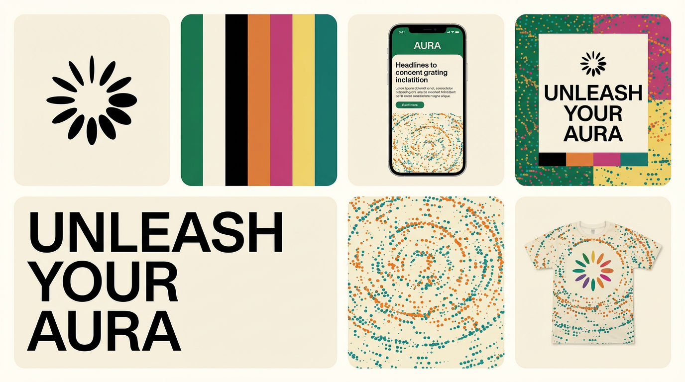 Brand Extension GeneratorDrop brand details, get identity boards
 Color TransferApply color grading from any reference
 Logo StylistStylize any logo with a new visual twist
 Character LockOne character, 6 different angles
Use the Icon Maker to Generate a Matched Icon Set
Generate matched icon sets from a prompt

Catherine Chung from FLORA