Ad Visual Concepts Prompt
Turn the connected ad strategy into a visual creative concept brief for paid social. Output 6 distinct ad visual concepts total: 3 for TikTok and 3 for Meta. For each concept include: concept name, target audience, core angle, opening visual, on-screen scene description, creator or subject type, UI or product visualization to show, headline or overlay text, emotional tone, and why this concept should convert. Make the concepts specific, performance-oriented, and tailored to a distraction-blocking deep work app for freelancers, creators, and remote workers. Prioritize subscription conversion. The TikTok concepts should feel UGC-native and motion-led. The Meta concepts should feel static, carousel, or short-form video friendly with direct-response clarity.
Meta Ad Scripts Prompt
Turn the connected visual concept brief into a platform-specific ad script document for Meta ads. Use only the concepts for that platform. For each concept, write 1 high-converting script tailored to subscription conversion for a distraction-blocking deep work app. Include: hook, scene-by-scene beat breakdown, voiceover or spoken lines, on-screen text, product UI moments, CTA, and why the script should convert. Keep the scripts specific, performance-oriented, and native to the platform. Output exactly 3 scripts total for that platform.
TikTok Ad Scripts Prompt
Turn the connected visual concept brief into a platform-specific ad script document for TikTok ads. Use only the concepts for that platform. For each concept, write 1 high-converting script tailored to subscription conversion for a distraction-blocking deep work app. Include: hook, scene-by-scene beat breakdown, voiceover or spoken lines, on-screen text, product UI moments, CTA, and why the script should convert. Keep the scripts specific, performance-oriented, and native to the platform. Output exactly 3 scripts total for that platform.
Ad Visual Concepts
PAID SOCIAL VISUAL CREATIVE CONCEPT BRIEF Distraction-Blocking + Deep Work Tracking App — Subscription Conversion --- TIKTOK CONCEPTS --- CONCEPT 1 — THE 6PM CONFESSION Concept Name: The 6PM Confession Target Audience: Freelance designers, developers, copywriters — Tier 1 cold traffic Core Angle: Guilt activation into reclamation. The emotional crash at end of day before the pivot to relief. Opening Visual: Extreme close-up on a laptop clock reading 6:02pm. The screen behind it is cluttered — 14 browser tabs, Slack open, a half-written doc. The creator's hands are visible, frozen above the keyboard. No voiceover. Just ambient room noise for 2 seconds. On-Screen Scene Description: Creator sits back in chair. They look at the ceiling. A beat of silence. Then they look directly into the camera and say — quietly, not dramatically — "I worked from 9am to 6pm today. I genuinely cannot tell you what I made." Cut immediately to their phone screen. The app is open. A session block is starting. Timer counts up. All social apps are greyed out. The session ends at 90 minutes. The deep work report appears. 1.5 hours. Real output named on screen. Creator back to camera: "This is the one part of my day that actually counts." Creator or Subject Type: Real freelance designer or copywriter, mid-30s, home office setting. Not polished. Natural lighting. Camera slightly below eye level. Should feel like a voice note, not an ad. UI or Product Visualization: Full-screen app view showing blocker activation — social apps visibly greyed out. Session timer counting up in real time. Post-session report screen shown for 3 seconds with hours and a named project label visible. Headline or Overlay Text: It is 6pm. Your calendar is full. Your output is empty. — overlaid in white text on dark background at the 3-second mark. At the end: One real session. Start yours free. Emotional Tone: Honest, tired, then quietly triumphant. Not hustle energy. The relief of finally having something to point to. Why This Concept Should Convert: Opens directly on the highest-resonance pain moment identified in the strategy — the 6pm crash. Shame activation in the first 3 seconds drives hook rate. The pivot to the app UI showing a completed session delivers the reclamation beat the audience needs to feel before clicking. The creator's non-performative tone creates trust. Trial CTA is frictionless and appears only after emotional resolution. --- CONCEPT 2 — THE PLATFORM PARADOX Concept Name: The Platform Paradox Target Audience: Solo creators monetizing via YouTube or newsletters — Tier 1, cold traffic Core Angle: Disruptive irony. You are watching a distraction-blocking ad on a distraction machine. Credibility through self-awareness. Opening Visual: Creator looks directly into camera and says immediately — no intro, no music — "The fact that you're watching this right now? That's exactly the problem we're solving." Long pause. Slight smirk. Not smug — conspiratorial. On-Screen Scene Description: Creator stays on camera. No cuts for the first 15 seconds. They continue: "I spent four years making content about productivity. I had a Notion template for everything. Still lost three hours a day to this app I'm talking to you through right now." Then they hold up their phone to camera — screen visible. The distraction-blocking app is open. "The difference isn't discipline. I just removed the exits." Cut to a screen recording of their phone. Social apps greyed out. A 90-minute writing session timer running. A finished YouTube script visible in a split-screen window. Back to creator: "Try it for 7 days. You'll see the number." Creator or Subject Type: Mid-career YouTuber or newsletter creator, authentically part of the creator economy, talks about their real output struggle. No corporate language. Should feel like a video essay opening, not a product demo. UI or Product Visualization: Phone screen held to camera showing app with blocker active — apps greyed in real time. Split screen: app timer on the left, content creation tool on the right (doc, video editor, or newsletter draft). End card showing session history over 14 days — visible improvement in session length. Headline or Overlay Text: Opening overlay (0–3 seconds): You're watching this on a distraction machine. We know. Mid-video overlay at the screen recording moment: 14-day session history. Real output. End card: 7 days free. No credit card. Emotional Tone: Wry, self-aware, conspiratorial. The creator is not above the problem — they are inside it and have found a way through. Audience should feel seen, not lectured. Why This Concept Should Convert: Directly executes the platform paradox angle identified as Priority 1 for TikTok. Naming the irony earns trust before a single product feature is mentioned. The creator's own output story mirrors the audience's identity threat. The session history visual delivers the proof frame at the moment of highest receptiveness. Comment-bait built in — platform resentment is culturally viral on TikTok. --- CONCEPT 3 — THE STREAK REVEAL Concept Name: The Streak Reveal Target Audience: Side hustlers and solopreneurs — Tier 2, warm retargeting and cold challenge-entry audiences Core Angle: Pride trigger plus behavioral proof. What 21 days of protected morning sessions accumulates to. Opening Visual: Phone screen fills the frame. A hand swipes open the app. The streak calendar loads — 21 consecutive days highlighted. The hand hovers over the screen. No voiceover for 2 seconds. Then creator voice, off-camera: "I did not believe this would work for me." On-Screen Scene Description: Creator comes on camera. Home office or kitchen table — clearly a side-hustle setup, not a professional studio. They describe their situation plainly: day job, 45-minute morning window, 5:45am before the house wakes up. They show the streak screen again — 21 days. "Every single one of those is 45 minutes I didn't lose to Instagram before I even had coffee." App shown in use: session starting, apps blocked, timer running in a 45-minute window. Post-session screen shows output: word count, tasks marked done, or project label. Creator back to camera: "The app doesn't care that I only have 45 minutes. It just locks everything else out so I actually use them." Creator or Subject Type: Relatable side hustler — building something real alongside a full-time job. Could be a freelance writer, a course creator, or a consultant in early-stage. Age 28–40. Energy is low-key determined, not motivational-speaker. UI or Product Visualization: Streak calendar shown twice — once at open, once at close. Session start and 45-minute timer clearly shown. Post-session output screen. The visual throughline is the calendar — every marked day is evidence. Headline or Overlay Text: Opening overlay: 21 days. 45 minutes each. Here's what that adds up to. Mid-video overlay on the session start: 45-minute block. Everything else locked. End card: Start your streak. Free for 7 days. Emotional Tone: Quiet pride. Accessible determination. Not aspirational — achievable. The audience should think: I could do 45 minutes. Not: I need to overhaul my life. Why This Concept Should Convert: The 45-minute morning window is explicitly named in the strategy as the highest-resonance use case for Tier 2 side hustlers. The streak visual functions as a trophy and proof artifact simultaneously. The low-commitment framing (45 minutes, not 4 hours) removes the overwhelm objection that kills conversion in this segment. Challenge format structure makes this Spark Ad-ready for organic amplification. --- META CONCEPTS --- CONCEPT 4 — THE COST CAROUSEL Concept Name: The Cost Carousel Target Audience: Freelancers billing hourly or project-based — Tier 1, cold prospecting Core Angle: Lost revenue framing. Distraction is not a focus problem. It is a billing problem. Financial urgency made visible and scannable. Opening Visual: Card 1 of 5. Bold white text on a deep charcoal background. No image. No product. Just the line: Your phone cost you $186 today. Subtext below in smaller type: Based on 3.1 distracted hours at $60/hour. The number is the scroll-stop. On-Screen Scene Description: - Card 1: The opening financial shock line. No image. Typography only. Dollar figure in large bold type. - Card 2: A clean split visual. Left side — a phone with social apps open, screen time showing 3 hours 14 minutes. Right side — app UI with session blocker active, timer at 2:47:00, three apps greyed. Label below each side: What your morning looked like. What it could look like. - Card 3: A stripped-down ROI table. Monthly subscription cost on one line. Recovered hours per week multiplied by average freelance hourly rate on the next. Net gain per month shown in bold at the bottom. Clean, scannable, no clutter. - Card 4: A session log screenshot from the app. Real-feeling data: four sessions over five days. Session lengths. Project labels. Total deep work hours for the week: 14.5. Subtext: This is what accountability looks like. - Card 5: CTA card. App icon. One line: Start your free 7-day trial. Subtext: No credit card. Cancel anytime. The math already told you why. Creator or Subject Type: No creator visible in this concept. Data and product UI do the persuasion. The audience is the subject — the copy mirrors their own situation back at them. UI or Product Visualization: Card 2 shows real app UI split against a distracted phone screen. Card 4 shows actual session log with named project fields and weekly total. Both should be genuine app screenshots, not mockups. Headline or Overlay Text: Card 1 headline: Your phone cost you $186 today. Card 3 headline: One recovered session per day. The math is simple. Card 5 headline: Start your free 7-day trial. Emotional Tone: Calm, precise, slightly uncomfortable. The tone is not angry — it is the quiet discomfort of a number you cannot unsee. Direct response clarity throughout. No warmth, no softening. Why This Concept Should Convert: Executes the Lost Revenue Framing angle identified as Priority 1 for Meta freelancer prospecting. The financial shock opener is engineered for thumb-stop in feed. Each card advances a single argument — shock, contrast, math, proof, resolution — without redundancy. The ROI table pre-empts the subscription cost objection before the CTA card arrives. Static carousel format is explicitly recommended for this angle in the strategy. --- CONCEPT 5 — THE PERMISSION REFRAME Concept Name: The Permission Reframe Target Audience: Remote workers held to output metrics and creators experiencing identity threat — Tier 1, cold prospecting and warm retargeting Core Angle: Shame reversal. You are not lazy. Your phone is designed against you. The product is permission, not punishment. Opening Visual: A single bold headline on a pale background fills the frame: You are not lazy. Your phone is designed to break your focus. Below it, in smaller type: That is not a character flaw. That is product design working exactly as intended. No app UI yet. No CTA. Just the line. On-Screen Scene Description: This is a 20–30 second Reel or video format. Opens on the headline card for 2 seconds — long enough to read, short enough to create tension. Cut to a real person (or a creator talking to camera in a clean, minimal setting): "Every time you open Instagram when you meant to work, that's not weakness. That's a billion-dollar algorithm doing its job. Your job is to remove it from the equation." Cut to the app being opened. Session block set for 90 minutes. The creator says: "90 minutes. Everything else locked. This is the system." App timer runs. End on the post-session screen: 1 hour 33 minutes of deep work. "Now you have proof you can do this." CTA overlay appears. Creator or Subject Type: A remote worker or creator who reads as thoughtful and self-aware — not a productivity influencer. They should feel like someone who has genuinely struggled with distraction and found a frame for it, not someone selling a morning routine. Gender and ethnicity should represent the breadth of the target audience. UI or Product Visualization: Session block setup shown in real time — apps being blocked visibly. Timer running. Post-session deep work report with total hours shown clearly. The UI should feel clean and decisive — minimal steps from open to locked. Headline or Overlay Text: Opening card text: You are not lazy. Your phone is designed to break your focus. Mid-video overlay at session start: 90 minutes. Everything else locked. End card: Proof you can focus. Start free for 7 days. Emotional Tone: Validating, then quietly empowering. The opening removes self-blame entirely. The product appears as a logical response to a structural problem — not a life hack, not a challenge. Relief, not hype. Why This Concept Should Convert: The Permission Angle is identified in the strategy as one of the two lead angles for cold traffic alongside the Thief Angle. Shame reversal is confirmed as a Priority 1 emotional hook across both platforms. This concept is designed to land especially hard with remote workers who feel invisible and creators who interpret distraction as identity failure. The post-session proof screen delivers the reclamation beat the strategy identifies as the highest-converting emotional arc closer. --- CONCEPT 6 — THE DEEP WORK REPORT REVEAL Concept Name: The Deep Work Report Reveal Target Audience: Remote workers with output accountability and experienced freelancers — Tier 1, retargeting and warm prospecting Core Angle: Data proof. Stop guessing how much you actually worked. Start knowing. The report is the product. Opening Visual: A clean Meta feed static image. Split vertically down the center. Left half: a phone showing a typical screen time report — 4 hours 12 minutes on social, 1 hour 3 minutes on productivity tools. The background is slightly washed out, slightly chaotic. Right half: the app's deep work report — 4 sessions, 5 hours 40 minutes of protected work, a weekly trend line moving upward. The background is clean white with a calm accent color. No headline yet. The contrast does the work. On-Screen Scene Description: This concept works as both a static image (the split described above) and a short 15-second Reel. For the Reel version: screen recording opens on the left side — normal phone, apps bleeding time. A hand swipes. The deep work report loads on the right. A voice says: "Most people think they work 6 hours a day. The app shows the real number. It's usually under 2." Report expands to full screen. Weekly totals visible. Session history scrollable. A 30-day trend line shows a clear upward curve from week one to week four. Voice: "This is what knowing looks like." CTA card. Creator or Subject Type: For the Reel version — a remote worker or senior freelancer, 30s–40s, professional enough to have output stakes but real enough to have experienced the gap between perceived and actual productivity. No lifestyle staging — a real desk, a real workday. UI or Product Visualization: The deep work report is the visual hero. Weekly session totals, session history list with project labels, and a 30-day trend line must all be visible and legible. This is the gated feature that sits behind the paywall — showing it here creates desire before the trial starts. Headline or Overlay Text: Static headline: You think you worked 6 hours today. This app shows the real number. Sub-headline: Session tracking. Distraction blocking. Combined. End card (Reel): Start your free trial. See your real number. Emotional Tone: Calm, precise, slightly provocative. The emotional register is the quiet shock of data — not fear, not shame. The tone should feel like a diagnostic, not a judgment. Sophisticated enough for the accountable remote worker and senior freelancer segments. Why This Concept Should Convert: The deep work report is explicitly identified in the strategy as the primary gated feature that should drive trial-to-paid conversion. Showing it in the ad creates desire for the data before the trial begins. The split-screen format mirrors the data visualization creative specifically recommended for remote worker targeting on Meta static and carousel. The real-number framing executes the Data Disruption Urgency angle — the gap between self-perception and reality — which the strategy flags as one of the most powerful conversion triggers available.
Meta Ad Scripts
META ADS — PLATFORM-SPECIFIC SCRIPT DOCUMENT Distraction-Blocking + Deep Work Tracking App — Subscription Conversion 3 High-Converting Scripts --- SCRIPT 1 — THE COST CAROUSEL Format: Static Carousel (5 Cards) Target Audience: Freelancers billing hourly or project-based — Tier 1 Cold Prospecting --- HOOK Card 1 delivers the scroll-stop. No image. No product. No brand introduction. A single financial shock line in bold white type on deep charcoal: Your phone cost you $186 today. Subtext beneath in smaller weight: Based on 3.1 distracted hours at $60/hour. The number is the hook. It mirrors the audience's own billing rate back at them as a loss figure. No explanation needed on Card 1. The discomfort of the number alone drives the swipe. --- SCENE-BY-SCENE BEAT BREAKDOWN - Card 1 — Financial Shock - Bold white headline on deep charcoal background - No image, no UI, no brand mark - Typography only: large dollar figure, small subtext showing the calculation - Sole purpose: stop the scroll and generate the question — wait, is that me? - Card 2 — The Contrast Split - Frame divided vertically down the center - Left side: a phone with social apps visible, screen time report showing 3 hours 14 minutes lost - Right side: app UI with session blocker active, timer reading 2:47:00, three social apps visibly greyed out - Label beneath each half in small caps: WHAT YOUR MORNING LOOKED LIKE — WHAT IT COULD LOOK LIKE - No voiceover. The visual contrast closes the argument before copy is needed. - Card 3 — The ROI Table - Clean white background, single-column layout - Line 1: Monthly subscription cost — [price] - Line 2: Hours recovered per week — 3.1 hrs x 4 weeks = 12.4 hours - Line 3: Value of recovered hours at $60/hr — $744 - Line 4 in bold: Net monthly gain — $[calculated figure] - No decoration. No padding. The math is the message. - Headline above the table: One recovered session per day. The math is simple. - Card 4 — Session Log Proof - Genuine app screenshot: session log showing four sessions over five days - Session lengths visible. Project labels named. Weekly deep work total: 14.5 hours - Subtext beneath the screenshot: This is what accountability looks like. - The data here is not aspirational — it reads as a real user record, not a marketing asset. - Card 5 — CTA Resolution - App icon centered on a clean background - Single headline: Start your free 7-day trial. - Subtext: No credit card. Cancel anytime. The math already told you why. - The final line references Card 3 deliberately — it rewards the user who swiped all the way through and frames the CTA as a logical conclusion, not a sales ask. --- VOICEOVER OR SPOKEN LINES None. This is a static carousel. All persuasion is carried by typography, UI visuals, and the card-by-card argument structure. Silence is intentional — it creates a diagnostic tone, not a pitch tone. --- ON-SCREEN TEXT (CARD BY CARD) - Card 1: Your phone cost you $186 today. / Based on 3.1 distracted hours at $60/hour. - Card 2: What your morning looked like. / What it could look like. - Card 3: One recovered session per day. The math is simple. / [ROI table as described above] - Card 4: This is what accountability looks like. / [Session log screenshot] - Card 5: Start your free 7-day trial. / No credit card. Cancel anytime. The math already told you why. --- PRODUCT UI MOMENTS - Card 2: App interface shown with distraction blocker active — social apps visually greyed, session timer running at 2:47:00. Real screenshot, not mockup. - Card 4: Session log view with project labels and session lengths visible. Weekly total of 14.5 deep work hours shown clearly. This is the proof artifact — it must read as authentic user data. --- CTA Card 5: Start your free 7-day trial. No credit card. Cancel anytime. The CTA arrives only after the five-card argument is complete. The audience who reaches Card 5 has already processed the financial loss frame, the contrast visual, the ROI calculation, and the session log. The CTA is a release, not an ask. --- WHY THIS SCRIPT SHOULD CONVERT The lost revenue frame is the highest-urgency angle available for freelancer cold prospecting on Meta. The dollar figure on Card 1 is engineered to create immediate self-identification — any freelancer who bills by the hour will run the calculation on their own rate before they finish reading. The carousel format turns a single argument into a five-step progression: shock, contrast, proof of math, proof of product, resolution. Each card has one job and no redundancy. The ROI table on Card 3 pre-empts the subscription cost objection before it can form. The session log on Card 4 delivers social proof through data rather than testimonial — a credibility format that performs significantly better with analytically-minded freelancer audiences. The final CTA line — the math already told you why — closes the loop on the opening hook and rewards attention without repeating it. --- --- SCRIPT 2 — THE PERMISSION REFRAME Format: 20–30 Second Reel Target Audience: Remote workers and creators experiencing identity threat — Tier 1 Cold Prospecting and Warm Retargeting --- HOOK Opening card. Pale background. No person on screen yet. Bold headline fills the frame: You are not lazy. Your phone is designed to break your focus. Smaller subtext below: That is not a character flaw. That is product design working exactly as intended. Hold for 2 seconds. Long enough to read fully. Short enough to create tension. The hook works because it names the self-accusation the audience already carries — and removes it before a single product feature is shown. --- SCENE-BY-SCENE BEAT BREAKDOWN - Scene 1 — Headline Card (0:00–0:02) - Static text card on pale background - Two-line headline: You are not lazy. / Your phone is designed to break your focus. - Subtext: That is not a character flaw. That is product design working exactly as intended. - No movement. No music. Stillness creates weight. - Sole purpose: remove shame, earn trust, hold attention into Scene 2. - Scene 2 — Creator to Camera, Reframe Spoken (0:02–0:10) - Cut to creator in a clean, minimal setting — real desk, natural light, nothing staged - Creator speaks directly to camera, calm and unhurried: - Spoken line: Every time you open Instagram when you meant to work — that is not weakness. That is a billion-dollar algorithm doing its job. Your job is to remove it from the equation. - No B-roll. No cuts. Eye contact held throughout. The stillness of this scene mirrors the stillness of the opening card — it reads as a conversation, not an ad. - Scene 3 — Product Introduction, Session Block Setup (0:10–0:18) - Creator picks up phone. Screen visible to camera. - App opens. Session block is set for 90 minutes. Social apps visibly greyed out in real time as the block activates. - Creator voiceover continues: 90 minutes. Everything else locked. This is the system. - On-screen text overlay appears at the moment the block activates: 90 minutes. Everything else locked. - No music yet. The UI moment is the drama. - Scene 4 — Timer Runs, Output Implied (0:18–0:22) - App timer running at speed — time-lapse or jump cut showing session in progress - No creator visible. Just the timer ticking forward. - Ambient sound only. Possibly keyboard sound beneath the timer. - This beat gives the audience a moment to project themselves into the session. - Scene 5 — Post-Session Report, Proof Delivered (0:22–0:27) - Post-session report screen fills the frame: 1 hour 33 minutes of deep work. Project label visible. - Creator voiceover: Now you have proof you can do this. - The line is quiet. Almost private. Not triumphant — relieved. - The report is the emotional payload of the entire ad. The audience should feel what the creator feels. - Scene 6 — CTA Card (0:27–0:30) - Clean card. App icon. Single headline. - On-screen text: Proof you can focus. Start free for 7 days. - No voiceover. No music sting. The silence carries the close. --- VOICEOVER OR SPOKEN LINES - Scene 2 (0:02–0:10): Every time you open Instagram when you meant to work — that is not weakness. That is a billion-dollar algorithm doing its job. Your job is to remove it from the equation. - Scene 3 (0:10–0:18): 90 minutes. Everything else locked. This is the system. - Scene 5 (0:22–0:27): Now you have proof you can do this. --- ON-SCREEN TEXT - Scene 1 (0:00–0:02): You are not lazy. Your phone is designed to break your focus. / That is not a character flaw. That is product design working exactly as intended. - Scene 3 overlay (0:13–0:16): 90 minutes. Everything else locked. - Scene 6 (0:27–0:30): Proof you can focus. Start free for 7 days. --- PRODUCT UI MOMENTS - Scene 3: Real-time app session setup — social apps greyed out as block activates. Shown on a real phone held to camera. Must be genuine UI, not screen mockup. - Scene 4: Timer running — app interface visible during the session. Clean, minimal, decisive. - Scene 5: Post-session deep work report — 1 hour 33 minutes of protected work. Project label visible. Weekly trend data optional if legible at this duration. --- CTA Scene 6: Proof you can focus. Start free for 7 days. The CTA reuses the word proof from the preceding voiceover line — it creates a linguistic bridge between the emotional beat and the action. The 7-day free trial is the only ask. No price mentioned. No feature list. The proof frame does the conversion work. --- WHY THIS SCRIPT SHOULD CONVERT The Permission Reframe works because it removes the primary conversion barrier — self-blame — before the product is introduced. Audiences in the remote worker and creator segments interpret distraction as a personal failure. An ad that opens by naming and dissolving that failure earns a level of trust that a feature-forward hook cannot. The structural arc — shame removed, system introduced, proof delivered, trial offered — mirrors the emotional journey the audience needs to complete before they will click. The creator's non-performative delivery in Scene 2 is the credibility mechanism: they are not above the problem, they are inside it. The post-session report in Scene 5 is the conversion trigger: it is the first moment the audience can imagine having a number to point to. The free trial CTA at the end is frictionless because the emotional work is already done. --- --- SCRIPT 3 — THE DEEP WORK REPORT REVEAL Format: 15-Second Reel + Static Feed Image (Dual-Format) Target Audience: Remote workers with output accountability and experienced freelancers — Tier 1 Retargeting and Warm Prospecting --- HOOK For the Reel: screen recording opens on a standard phone screen. A typical screen time report is visible — 4 hours 12 minutes on social apps, 1 hour 3 minutes on productivity tools. A voice begins immediately: Most people think they worked 6 hours today. The app shows the real number. It's usually under 2. For the Static: a split image divided vertically. Left half — washed-out, slightly chaotic phone with screen time bleeding into social. Right half — the app's deep work report, clean and precise, showing 5 hours 40 minutes of protected sessions. No headline needed on first impression. The contrast is the hook. --- SCENE-BY-SCENE BEAT BREAKDOWN - Scene 1 — Screen Time Reality (0:00–0:04) - Screen recording: standard iOS or Android screen time report - 4 hours 12 minutes on social. 1 hour 3 minutes on productivity tools - No creator visible. No brand. Just the data. - Voiceover begins immediately: Most people think they worked 6 hours today. The app shows the real number. It's usually under 2. - The gap between perceived and actual productivity is the hook. The audience feels it before they can intellectualize it. - Scene 2 — The Swipe Transition (0:04–0:06) - A hand enters frame. Swipes the screen. - The deep work report loads — clean, precise, high-contrast against the chaos of the previous screen. - No voiceover during the swipe. The gesture and the visual shift do the work. - This is the hinge of the entire ad. The swipe is the product promise made physical. - Scene 3 — Report Expands, Data Made Visible (0:06–0:12) - Deep work report fills the screen - Visible data points: four sessions this week, total protected hours, project labels for each session, a 30-day trend line showing a clear upward curve from week one to week four - The report is scrollable — show this in motion. The audience should see more data appearing as the scroll happens. - Voiceover: This is what knowing looks like. - On-screen text overlay: 30 days. Real sessions. Real output. - The report is not an interface tour. It is evidence. The tone of this scene is diagnostic, not demonstrative. - Scene 4 — Creator Anchor (0:12–0:13) - Optional one-second cut to creator at desk — looking at their screen, not at the camera - No lines. No gesture toward the camera. Just presence. - Grounds the data in a real human workday without interrupting the data-driven momentum of the ad. - Scene 5 — CTA Card (0:13–0:15) - Clean card. App icon. One line. - On-screen text: Start your free trial. See your real number. - The phrase your real number echoes the hook voiceover — closes the loop on the opening question and makes the CTA feel like the answer to the first line of the ad. --- VOICEOVER OR SPOKEN LINES - Scene 1 (0:00–0:04): Most people think they worked 6 hours today. The app shows the real number. It's usually under 2. - Scene 3 (0:09–0:12): This is what knowing looks like. --- ON-SCREEN TEXT - Scene 1: You think you worked 6 hours today. This app shows the real number. [Overlay on screen time report — appears at 0:02] - Scene 3: 30 days. Real sessions. Real output. [Overlay on report screen — appears at 0:08] - Scene 5: Start your free trial. See your real number. For Static Format — Headline: You think you worked 6 hours today. This app shows the real number. / Sub-headline: Session tracking. Distraction blocking. Combined. --- PRODUCT UI MOMENTS - Scene 1: Standard screen time report shown as contrast baseline — not the app, but the problem the app solves. Must feel like a real phone, not a staged screenshot. - Scene 2–3: Deep work report as the visual hero. Weekly session totals, project-labeled session history, and a 30-day upward trend line must all be visible and legible. This is the gated feature behind the paywall — showing it here creates desire before the trial begins. - The report must be a genuine app screenshot. Any visual artificiality collapses the trust the data is designed to build. --- CTA Scene 5: Start your free trial. See your real number. The phrase your real number is the linguistic throughline of the entire script — it appears in the hook voiceover, echoes in the scene 3 overlay, and closes the ad. The CTA is not a generic trial offer. It is a specific promise: the trial will show you something you do not currently know about yourself. That specificity is the conversion lever. --- WHY THIS SCRIPT SHOULD CONVERT The deep work report is the primary gated feature identified for trial-to-paid conversion. Showing it in the ad creates desire for the data before the trial begins — the audience arrives at signup already wanting to see their own version of the report. The gap between self-perceived productivity and actual tracked output — 6 hours assumed versus under 2 hours real — is one of the most potent disruption triggers available for this audience segment. Remote workers with output accountability are specifically motivated by data they can point to; this ad shows them exactly what that data looks like and withholds it behind a free trial. The screen-time-to-report swipe transition in Scene 2 compresses the entire product promise into a single physical gesture. The dual-format execution — Reel and static — allows this concept to run across feed placements without creative duplication, maximizing reach efficiency within the retargeting pool.
TikTok Ad Scripts
TIKTOK AD SCRIPTS Distraction-Blocking + Deep Work Tracking App — Subscription Conversion 3 Platform-Native Scripts --- SCRIPT 1 — THE 6PM CONFESSION FORMAT: Talking-head creator video, vertical 9:16, 45–60 seconds TARGET: Freelance designers, developers, copywriters — cold traffic CONVERSION GOAL: Free trial sign-up --- HOOK (0–3 seconds) Visual: Extreme close-up on a laptop clock. 6:02pm. 14 browser tabs visible behind it. Slack open. A half-written doc. Two hands frozen above the keyboard. Dead still. On-Screen Text: It is 6pm. Your calendar is full. Your output is empty. No music. No voiceover. Just ambient room tone — a fan, a faint notification ping. Hold for 2 full seconds. The silence does the work. Why this hook converts: The timestamp is the scroll-stop. Any freelancer who has had this exact moment — and almost all of them have — will stop mid-scroll the moment they see 6pm on a cluttered screen. The on-screen text confirms the feeling before anyone has to say it out loud. --- BEAT BREAKDOWN Beat 1 — The Confession (3–12 seconds) Creator sits back in chair. Looks at the ceiling. A beat of loaded silence. Then turns directly to camera. Low energy. Not dramatic. Completely honest. Spoken lines: I worked from 9am to 6pm today. I genuinely cannot tell you what I made. No music yet. Natural light. Slightly below eye level. This should feel like a voice note someone accidentally posted. Beat 2 — The Turn (12–20 seconds) Creator picks up phone. Screen faces camera. Spoken lines: I started using this. Not because I thought it would fix me. Because I ran out of other explanations. On-Screen Text: (none — let the product UI breathe) Product UI Moment 1: App opens. Session block is set. Social apps visibly grey out in real time — Instagram, TikTok, Twitter all dim. A session timer begins counting up from 0:00. Beat 3 — The Session (20–35 seconds) Time-lapse or jump cut: timer moves. 00:14 — 00:31 — 01:02 — visible progress. Creator is off-screen. The phone is the subject. Spoken lines (soft voiceover under the time-lapse): 90 minutes. That is all. Everything else was locked out. On-Screen Text: Apps blocked. Timer running. No exits. Beat 4 — The Report (35–45 seconds) Product UI Moment 2: Session ends. Post-session deep work report fills the screen. Visible on screen: 1 hour 33 minutes. Project label reading "Client deck — section 2 done." Creator back on camera. Quiet. Something close to relief. Spoken lines: This is the one part of my day that actually counts. On-Screen Text: 1.5 hours. Real output. One session. Beat 5 — CTA (45–55 seconds) Creator looks at camera one more time. Tone stays flat — not a pitch, a suggestion. Spoken lines: There is a free trial. No credit card. Try one session and see what it feels like to actually finish something. On-Screen Text: One real session. Start yours free. [App name + link in bio] --- FULL SPOKEN SCRIPT [0–3s — silence, on-screen text only] [3s] I worked from 9am to 6pm today. I genuinely cannot tell you what I made. [12s] I started using this. Not because I thought it would fix me. Because I ran out of other explanations. [20s — voiceover] 90 minutes. That is all. Everything else was locked out. [35s — back on camera] This is the one part of my day that actually counts. [45s] There is a free trial. No credit card. Try one session and see what it feels like to actually finish something. --- WHY THIS SCRIPT CONVERTS - The 6pm hook activates the single highest-resonance pain moment for freelancers — the end-of-day gap between hours logged and work produced - Shame is triggered in the first 3 seconds without the creator ever using shame language — the clock and the silence do it structurally - The creator's low-energy, non-performative tone signals authenticity to a TikTok audience trained to reject ad polish - The UI moment showing apps greying out delivers the reclamation beat visually, before the creator has to claim the product works - The post-session report shows a named, specific output — not a vague number — which is the proof format that earns trust in this segment - CTA arrives only after the emotional arc is complete — guilt, then relief, then invitation --- --- SCRIPT 2 — THE PLATFORM PARADOX FORMAT: Direct-to-camera creator monologue, vertical 9:16, 45–60 seconds TARGET: Solo creators monetizing via YouTube or newsletters — cold traffic CONVERSION GOAL: Free 7-day trial sign-up --- HOOK (0–3 seconds) Visual: Creator dead center in frame. Minimal background — a blank wall or dark shelf. No intro. No music. Eye contact immediate. Spoken lines (first words, no delay): The fact that you are watching this right now? That is exactly the problem we are solving. On-Screen Text: You're watching this on a distraction machine. We know. Pause. Slight smirk. Not smug — conspiratorial. Like they just caught you both doing the same thing. Why this hook converts: Naming the irony in the first three words is a pattern interrupt that earns attention by treating the viewer as intelligent. It defuses the ad-detection reflex. The comment section will write itself. --- BEAT BREAKDOWN Beat 1 — Credibility Through Confession (3–18 seconds) Creator stays on camera. No cuts. No B-roll. Just the monologue. Spoken lines: I spent four years making content about productivity. I had a Notion template for everything. I talked about deep work constantly. I still lost three hours a day to this exact app I am talking to you through right now. On-Screen Text: (none — sustained eye contact is the hook) Tone: Wry. Self-aware. The creator is not above the problem. They are inside it. Beat 2 — The Distinction (18–28 seconds) Creator holds up their phone. Screen facing camera. Steady hand — this should feel unscripted. Spoken lines: The difference is not discipline. I did not get more disciplined. I just removed the exits. Product UI Moment 1: App visible on phone screen. Distraction blocker active. Instagram, YouTube, TikTok all visibly greyed out. On-Screen Text: Not discipline. No exits. Beat 3 — The Screen Recording (28–42 seconds) Cut to a screen recording of the creator's phone. Split view: left side shows the app timer running at 1:04:22. Right side shows a newsletter draft or YouTube script open and being written. Voiceover: This is a 90-minute writing session. Every distraction removed. I came out with a finished first draft. On-Screen Text: 90-minute session. No exits. One finished draft. The recording ends. Cut back to creator on camera. Beat 4 — The Evidence Close (42–50 seconds) Product UI Moment 2: Creator shows their phone again. A 14-day session history is visible on screen. The session lengths visibly increase from week one to week two — early sessions at 30–40 minutes, later sessions at 75–90 minutes. No commentary needed. Spoken lines: That is 14 days. You can see the number go up. That is what removing exits does over time. Beat 5 — CTA (50–58 seconds) Creator back to camera. Tone casual, not closing-pitch energy. Spoken lines: Seven days free. No credit card. If you finish more in one session than you did all of last week, you will understand why people stay. On-Screen Text: 7 days free. No credit card. Link in bio. --- FULL SPOKEN SCRIPT [0s] The fact that you are watching this right now? That is exactly the problem we are solving. [3s] I spent four years making content about productivity. I had a Notion template for everything. I talked about deep work constantly. I still lost three hours a day to this exact app I am talking to you through right now. [18s] The difference is not discipline. I did not get more disciplined. I just removed the exits. [28s — voiceover over screen recording] This is a 90-minute writing session. Every distraction removed. I came out with a finished first draft. [42s] That is 14 days. You can see the number go up. That is what removing exits does over time. [50s] Seven days free. No credit card. If you finish more in one session than you did all of last week, you will understand why people stay. --- WHY THIS SCRIPT CONVERTS - Opening with the platform paradox earns trust before a single product feature is named — the irony functions as a credibility deposit - Sustained no-cut eye contact in Beat 1 mimics the emotional register of a video essay open, which is native to the creator audience being targeted - The held phone showing greyed-out apps is more persuasive than any voiceover claim — the viewer can see the lock in real time - The 14-day session history showing upward progress converts the abstract promise of improved focus into visible, specific behavioral data - The CTA is framed as an outcome test, not a product pitch — if you finish more than last week, you will know — which reduces psychological resistance at the decision point - Platform resentment and creator identity threat are both culturally viral on TikTok, making this concept a natural comment-bait vehicle for organic amplification beyond paid reach --- --- SCRIPT 3 — THE STREAK REVEAL FORMAT: Creator-to-camera with phone screen inserts, vertical 9:16, 45–60 seconds TARGET: Side hustlers and solopreneurs — warm retargeting and cold challenge-entry audiences CONVERSION GOAL: Free trial entry via streak challenge framing --- HOOK (0–3 seconds) Visual: Phone screen fills the entire frame. A hand swipes the app open. A streak calendar loads — 21 consecutive days, each day lit up. The hand hovers over the screen. Holds. Does not tap. On-Screen Text: 21 days. 45 minutes each. Here is what that adds up to. No voiceover. No music yet. The calendar is the hook. Why this hook converts: The streak visual is a trophy and a proof artifact at the same moment. Side hustlers who have ever failed to protect their morning window will feel the pull of those 21 filled days immediately. The low number — 45 minutes — signals that this is achievable before a single word is spoken. --- BEAT BREAKDOWN Beat 1 — The Setup (3–15 seconds) Creator comes on camera. Kitchen table or simple home office. Nothing staged. This is clearly a side-hustle environment — a full-time-job life with a project running alongside it. Spoken lines: I have a full-time job. Two kids. The only window I have is 5:45am before anyone else wakes up. That is 45 minutes. I thought that was not enough to matter. On-Screen Text: Full-time job. 45 minutes. 5:45am. Tone: Low-key and direct. Not motivational. Not defeated. Just accurate. Beat 2 — The Streak Return (15–25 seconds) Creator holds phone back up to camera. The streak calendar fills the screen again. Spoken lines: Every single one of those 21 days is 45 minutes I did not lose to Instagram before I even had coffee. Product UI Moment 1: Slow pan across the streak calendar — each lit day visible. A tap opens the session detail for one day: 5:47am start time, 45-minute timer, session complete. On-Screen Text: 21 sessions. Zero scrolling. All before coffee. Beat 3 — The Session Demonstration (25–38 seconds) Cut to a screen recording. The app is being opened. Session duration set to 45 minutes. Blocker activated — social apps grey out. Timer begins: 0:00 — 0:01 — 0:02. Voiceover: You set the window. The app locks everything else out. That is the whole thing. There is no willpower required. There are just no other options. On-Screen Text: Set the window. Lock everything else. No willpower needed. Product UI Moment 2: Timer running at 22:14. Greyed apps visible. A writing doc or task list in split view alongside the timer. Beat 4 — The Output Close (38–48 seconds) Post-session report fills the screen: 45 minutes. Project label: "Chapter 3 — first pass done." Weekly total for the current week: 3 hours 45 minutes. Creator back on camera. Spoken lines: The app does not care that I only have 45 minutes. It just locks everything else out so I actually use them. On-Screen Text: 45 minutes used. Not wasted. Beat 5 — CTA (48–58 seconds) Creator looks at camera. Calm, not hyped. Spoken lines: If you have 30 minutes in the morning that keep disappearing, try this for 7 days. Free. No card. See if you get a streak going. On-Screen Text: Start your streak. Free for 7 days. No credit card. [App name + link in bio] --- FULL SPOKEN SCRIPT [0–3s — silence, streak calendar visual, on-screen text only] [3s] I have a full-time job. Two kids. The only window I have is 5:45am before anyone else wakes up. That is 45 minutes. I thought that was not enough to matter. [15s] Every single one of those 21 days is 45 minutes I did not lose to Instagram before I even had coffee. [25s — voiceover over screen recording] You set the window. The app locks everything else out. That is the whole thing. There is no willpower required. There are just no other options. [38s — back on camera] The app does not care that I only have 45 minutes. It just locks everything else out so I actually use them. [48s] If you have 30 minutes in the morning that keep disappearing, try this for 7 days. Free. No card. See if you get a streak going. --- WHY THIS SCRIPT CONVERTS - The streak calendar as the opening visual is a dual-function hook — it functions as social proof and as an aspirational identity object simultaneously, stopping the scroll before any spoken word lands - The 45-minute framing is the single most important conversion variable for the side hustler segment — it removes the overwhelm objection that kills trial sign-ups in this audience by positioning the product as compatible with a constrained, real life rather than requiring a rebuilt one - The 5:45am detail is a specificity signal — it tells the viewer this is a real account of a real constraint, not a lifestyle narrative - The no-willpower framing in Beat 3 directly reframes the product from a productivity tool into a structural solution, which is the highest-converting angle for audiences who have already failed with discipline-based approaches - The challenge-style CTA — see if you get a streak going — activates the same behavioral trigger that makes streak mechanics effective inside apps, and mirrors the language of TikTok challenge culture natively - The 7-day free trial aligned with a 7-day streak start creates a natural conversion window: the first seven sessions become the trial experience, which means engagement with the core product loop begins before the paywall decision arrives
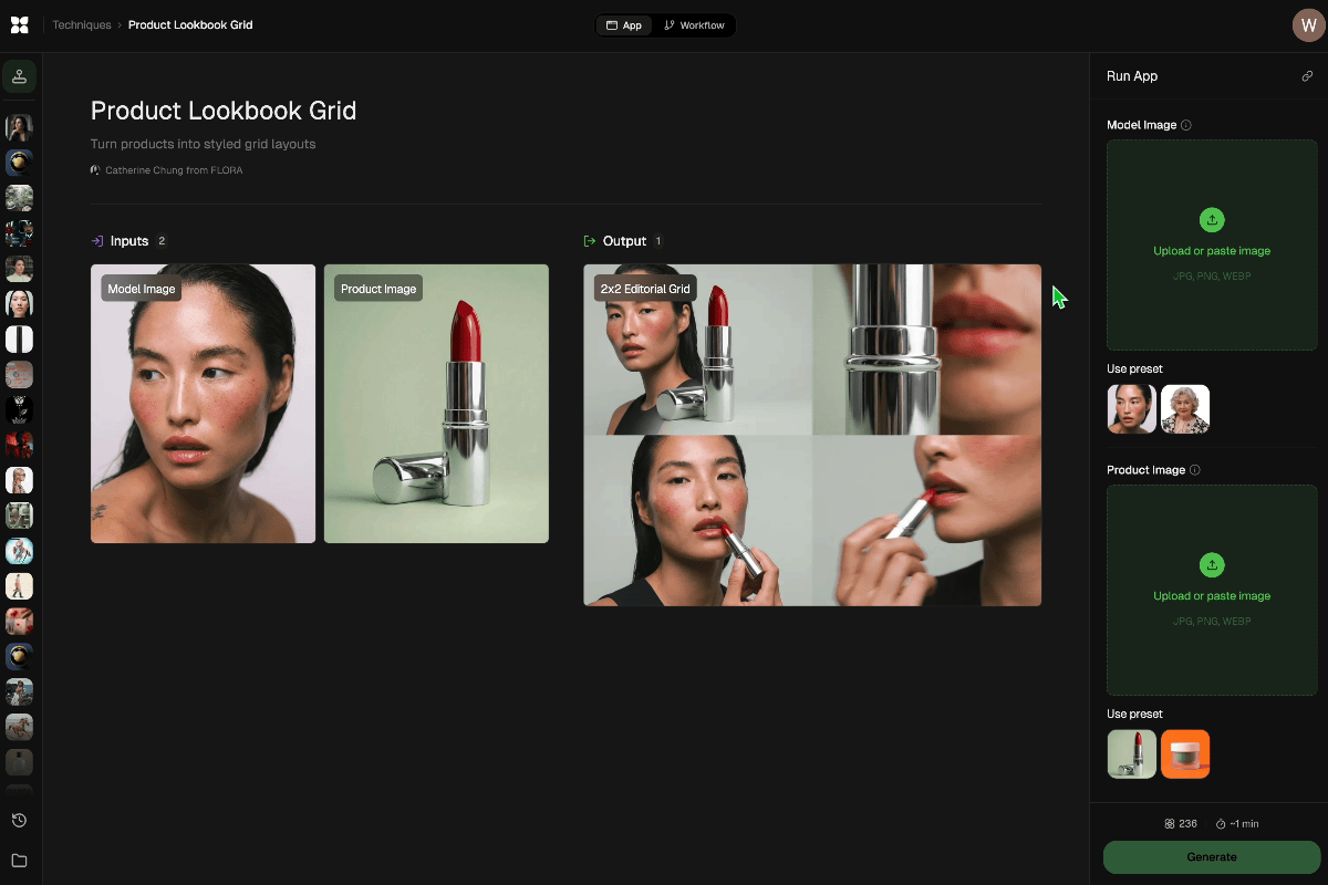
Run this AI-powered technique in your browser. Upload your inputs, hit generate, and get professional results in moments.

Creative Production
Design teams use FLORA techniques to produce professional-quality creative assets in seconds, accelerating production timelines and reducing dependency on manual editing.

Marketing Content
Marketing teams generate on-brand visual content for campaigns, social media, and ads — iterating quickly on concepts without waiting for design resources.

Product Visualization
E-commerce and product teams create high-quality product visuals, mockups, and lifestyle imagery to showcase their offerings across channels.
How to use Techniques?
Discover how to utilize Conversion Creative Intelligence Engine™ for different scenarios.
Add inputs
Upload images, videos, or type in the prompts to get started.
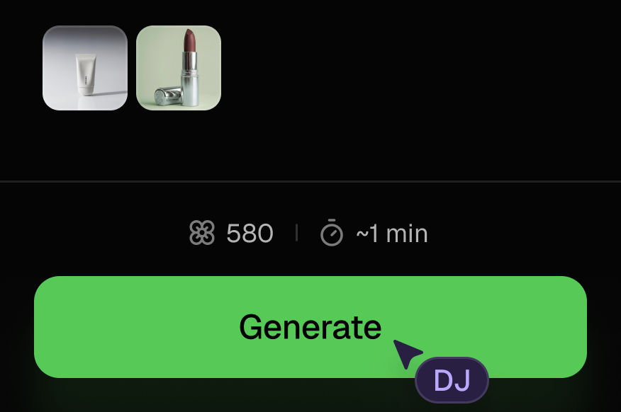
Generate outputs
Next, hit the "Generate" button to start generating your outputs.
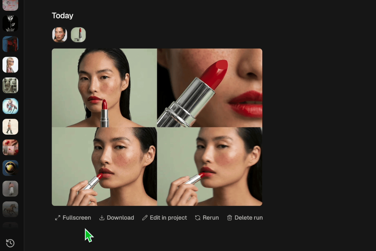
Edit and export
Refine your outputs on canvas, or download them directly.
Frequently asked questions
All you need to know about Conversion Creative Intelligence Engine™
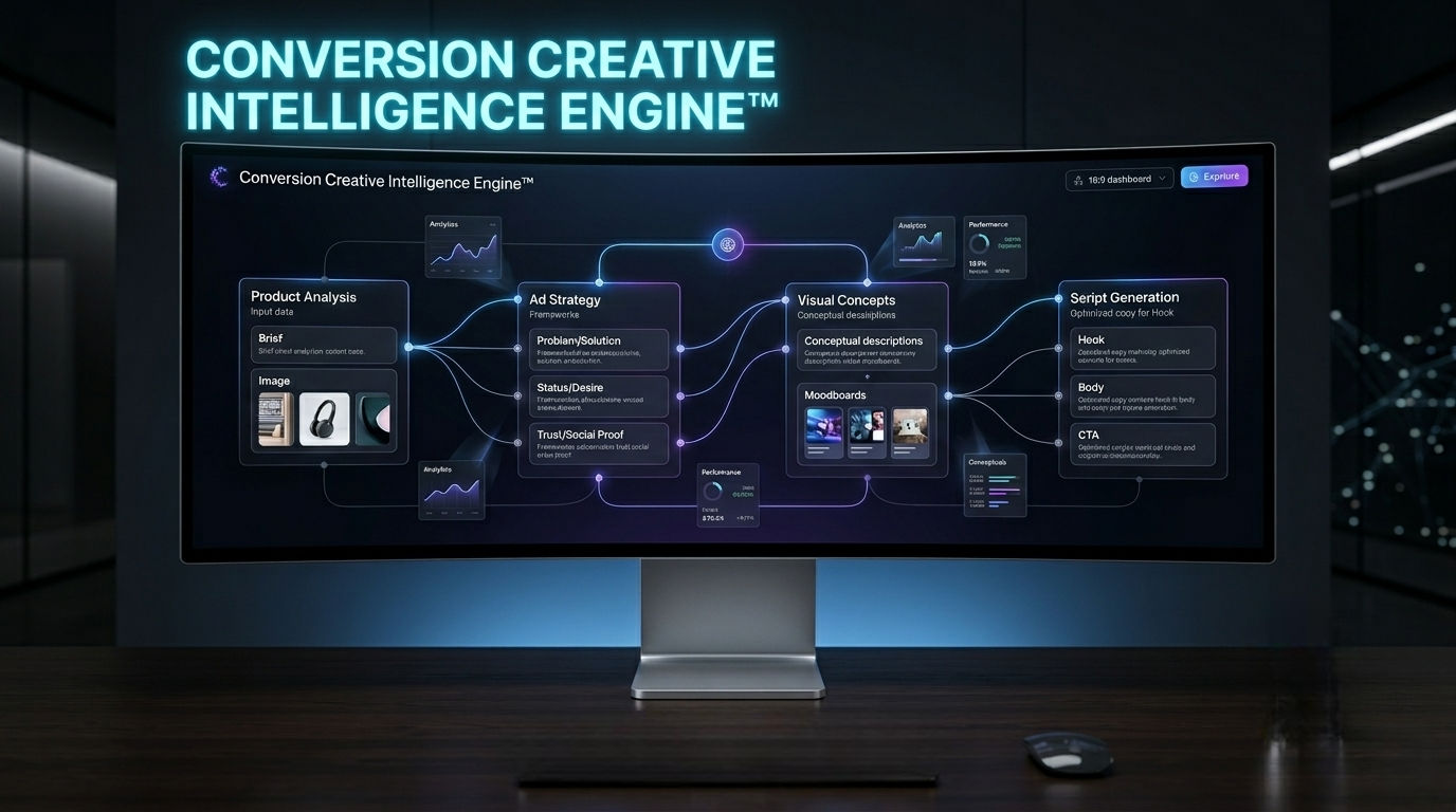
Conversion Creative Intelligence Engine™
A performance-first system that turns a product into full ad strategy, visual concepts, and high-conversion TikTok & Meta scripts.

Gilberto Riveros