
Category Trap Report
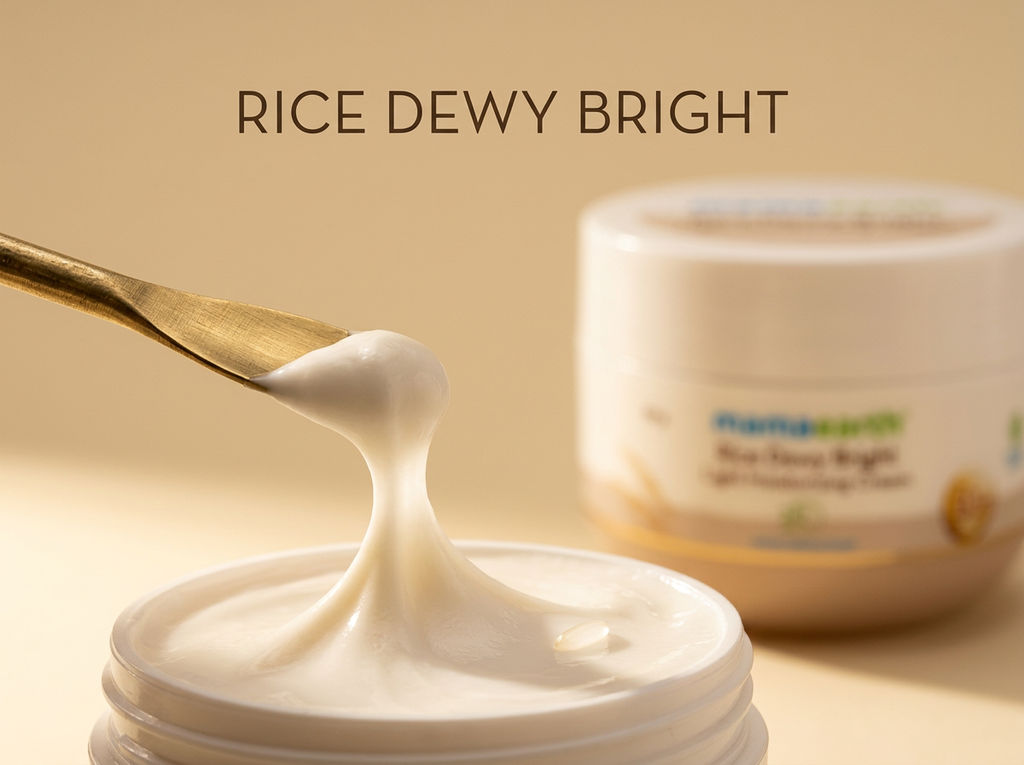
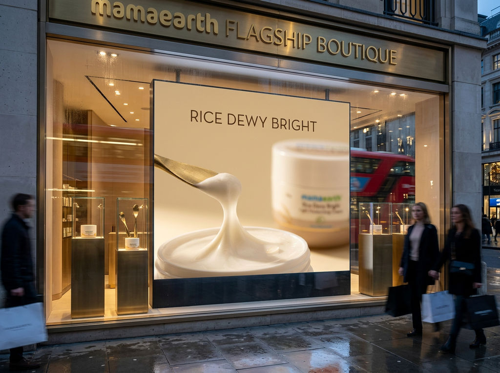
PRODUCT: Mamaearth Rice Dewy Bright Light Moisturizing Cream — a 50g face moisturizer in a wide-mouth jar. Mid-market, clean-beauty-adjacent positioning targeting Indian consumers seeking brightening and hydration benefits. Ingredient-led branding (Rice, B3+) with a nature-meets-efficacy promise. CATEGORY: Mass-to-masstige facial moisturizer / skincare cream (Indian & broader Asian clean beauty market) --- CATEGORY TRAP REPORT — 5 VISUAL CLICHÉS THIS CATEGORY IS STUCK IN: TRAP 1: The Ingredient Illustration Decoration Visual signature: Flat or semi-realistic botanical/ingredient art — here, golden rice stalks — floated onto the lower left of the label as a decorative motif against a warm beige gradient. It appears on nearly every natural skincare product regardless of brand tier. Why brands do it: Brands fear that consumers won't believe the ingredient story without a visual proof point on-pack. It feels like transparency and naturalness made visible. Why it makes brands invisible: When every brand from drugstore to premium uses the same floating botanical, the illustration becomes wallpaper. The eye skips it entirely, and the ingredient story loses all credibility as a differentiator. TRAP 2: The Beige-to-White Gradient Jar Visual signature: A rounded, wide-mouth jar split into a warm sandy-beige lower half and a clean white upper half, often with a thin gold accent line at the divide — exactly as seen here. The palette signals natural, gentle, and skin-toned. Why brands do it: The warm neutral palette codes as clean, safe, and skin-friendly, borrowing visual equity from luxury skincare (think La Mer, Fresh) at a fraction of the price. Why it makes brands invisible: The entire moisturizer aisle now lives in this same beige-white-gold zone. On a shelf or a scroll, these jars blur into a single indistinguishable mass of muted tones. TRAP 3: The Badge Cluster Overload Visual signature: Multiple certification or claim badges crammed onto the label — here, a Made Safe leaf seal, a B3+ golden orb, and a 24 Hrs Moisturization clock icon all compete for attention in the lower half of the jar. Each badge has its own color, shape, and style. Why brands do it: Brands fear that a single claim won't be enough to close the sale. More badges feel like more proof, more trust, more reassurance. Why it makes brands invisible: The visual noise collapses into clutter. No single claim lands because none gets hierarchy or breathing room. Consumers scan and retain nothing specific. TRAP 4: The Clean Sans-Serif + Script Name Pairing Visual signature: A cheerful, rounded sans-serif logo (Mamaearth in blue-green) paired with a product name set in a warm brown serif or semi-serif — Rice Dewy Bright in mixed weights. Friendly logo up top, earthy product name below. This two-font trust formula is universal in this category. Why brands do it: The combination attempts to signal both modernity (sans-serif = approachable, digital-native) and naturalness (warm serif = organic, heritage). It feels balanced and safe. Why it makes brands invisible: The formula is so widely replicated across Indian clean beauty brands that the typographic system no longer communicates brand personality — it communicates category membership, nothing more. TRAP 5: The Functional Clock/Timer Icon as Hero Graphic Visual signature: A circular clock icon with 24 Hrs displayed prominently as a central design element, rendered in teal/green to imply scientific credibility. Positioned mid-label as if it were a feature, not a support claim. Why brands do it: The 24-hour hydration claim is a conversion trigger backed by consumer research, so brands elevate it visually to make it feel like a product truth rather than a marketing line. Why it makes brands invisible: The 24-hour clock icon has become so ubiquitous across moisturizers, serums, and sunscreens that it now reads as a generic category signal — not a brand-specific benefit. It adds visual busyness without adding brand memory. --- SEVERITY RATING: Trap 2 — The Beige-to-White Gradient Jar — is the most damaging because it operates at the structural, form level before a consumer even reads a single word, making shelf and scroll differentiation almost impossible. When the container itself is indistinguishable from dozens of competitors, no amount of clever typography or ingredient storytelling on the label can recover the lost first-glance attention.
Escape Routes Strategy
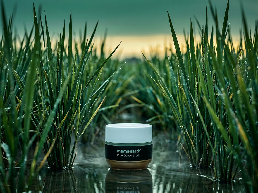
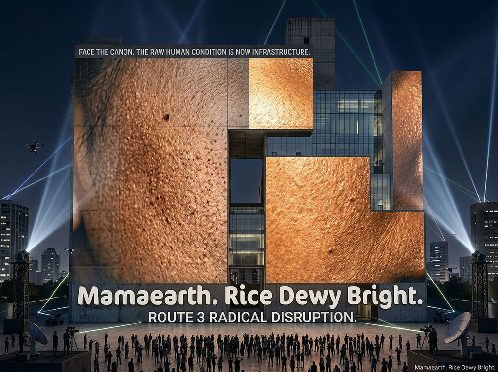
ESCAPE ROUTE 1 — MODERATE DISRUPTION Strategy name: Grain In Motion Core concept: Replace the static jar-on-surface format with a product shot where the moisturizer's texture becomes the visual hero — a close-up of the cream mid-scoop, caught in motion, where the rice-origin story lives inside the material itself rather than as a decorative illustration bolted onto the outside. What this breaks: Trap 1 (Ingredient Illustration Decoration), Trap 3 (Badge Cluster Overload) Visual execution brief: Shoot the cream being lifted from the jar with a single finger or a small gold spatula, captured at a precise moment where the texture pulls into a slow, elastic peak. Lighting is a single raking side light source — warm but directional, like late afternoon sun through rice paper — casting micro-shadows that reveal the grain-smooth texture of the cream itself. Background is a deep matte warm ivory, not gradient, not white — closer to unpolished rice husk. No badges on pack in this shot; the jar sits defocused in the rear third of the frame. Typography floats in the negative space using only the product name in a single weight, no hierarchy fight. The cream's surface should catch a single specular highlight — one clean reflection point only. Mood: handmade precision, quiet luxury, tactile restraint. Reference aesthetics: - Irving Penn's still life food photography (tactile product surfaces, single-source dramatic light, quiet authority) - Kinfolk magazine's early editorial era (matte warmth, deliberate negative space, material honesty) - Céline under Phoebe Philo's visual identity (restraint as confidence, no decoration without function) What makes this stop the scroll: The motion and texture of the cream itself — the audience has never seen the product behave, only sit. A cream mid-pull communicates freshness, richness, and skin-feel before a single word is read. --- ESCAPE ROUTE 2 — STRONG DISRUPTION Strategy name: The Rice Field Inversion Core concept: Flip the visual grammar entirely — instead of putting the product in an aspirational lifestyle context or on a clean surface, place the jar inside a macro rice paddy landscape, making the product the smallest element in a vast natural environment. The brand becomes the world, not the object. What this breaks: Trap 2 (Beige-to-White Gradient Jar), Trap 4 (Clean Sans-Serif + Script Pairing), Trap 1 (Ingredient Illustration Decoration) Visual execution brief: The jar sits at ground level in a real or hyper-real rendered rice paddy at early dawn — water still on the soil, rice stalks at 10x the height of the jar, catching first light at a cool green-gold. The jar's label faces the camera but occupies only the lower 15% of the frame — the image is 85% landscape, 15% product. The label itself is redesigned for this shot: stripped to one line of text only, printed white on a near-black band that wraps the jar's middle — a complete departure from beige-white. The color palette of the overall image is cool jade, wet earth, and pale gold — nothing warm and milky. Atmosphere is pre-sunrise stillness, slight mist rising from the paddy water. Shot on a tilt-shift lens to miniaturize the real and surrealize the scale relationship between product and world. Reference aesthetics: - Gregory Crewdson's suburban tableaux (hyper-constructed still atmosphere, scale displacement, cinematic tension) - Japanese pharmaceutical brand Shiro's early campaign imagery (product as artifact inside natural systems) - Wong Kar-wai's In the Mood for Love color palette (deep jade, gold, atmospheric compression) What makes this stop the scroll: The radical scale reversal — the product does not dominate the frame. This reads as either art or luxury fragrance advertising, never as a face cream. The category violation itself creates the pause. --- ESCAPE ROUTE 3 — RADICAL DISRUPTION Strategy name: Skin Is The Surface Core concept: Remove the jar entirely from the visual. The product's visual identity becomes a specific patch of real human skin — its texture, its translucency, its response to moisture — shot at macro scale so that skin becomes landscape. The cream is present only as sheen, as change, as evidence. What this breaks: Trap 1, Trap 2, Trap 3, Trap 4, Trap 5 — all five simultaneously Visual execution brief: An extreme macro shot of a cheekbone or forearm, lit with a cold clinical ring light that suddenly transitions mid-frame to a warm raking light — the visual seam between dry and moisturized skin made visible as a lighting shift rather than a before/after split. The skin fills 100% of the frame. No jar. No badge. No gradient. No sans-serif logo in this hero image. The only text is a single line printed in the darkest corner of the image: Mamaearth. Rice Dewy Bright. Small. Calm. Unapologetic. The skin's surface should reveal pores, fine texture, and a faint luminous sheen on the lit half — not retouched into plastic smoothness but celebrated as real biological material catching light. Color palette is the actual spectrum of Indian skin tones: warm umber, golden undertone, deep mahogany — not the abstracted beige of the category. Reference aesthetics: - Nick Knight's close-skin beauty photography for Yohji Yamamoto (skin as abstract landscape, texture over perfection) - Vasantha Yogananthan's photographic treatment of Indian light and skin (documentary warmth, material truth) - Comme des Garçons fragrance campaign art direction — Rei Kawakubo era (total removal of product from frame, concept as the product) What makes this stop the scroll: There is no jar. In a category where every image is a jar, the absence of the jar is the loudest possible visual statement. The viewer's first question is: what am I looking at? That question is the brand's first victory. --- SYNTHESIS NOTE: A film combining all three routes opens on a single drop of cream falling in extreme slow motion against total darkness — the texture of Route 1 — before the frame pulls wide to reveal it falling into a rain-soaked rice paddy at dawn, the landscape scale of Route 2, the cold-to-warm light shift visible across the water's surface. The final frame cuts to a close macro of skin absorbing that same light, no product in sight, only the proof — the quiet, luminous evidence of Route 3. The brand name appears once, last, in silence.
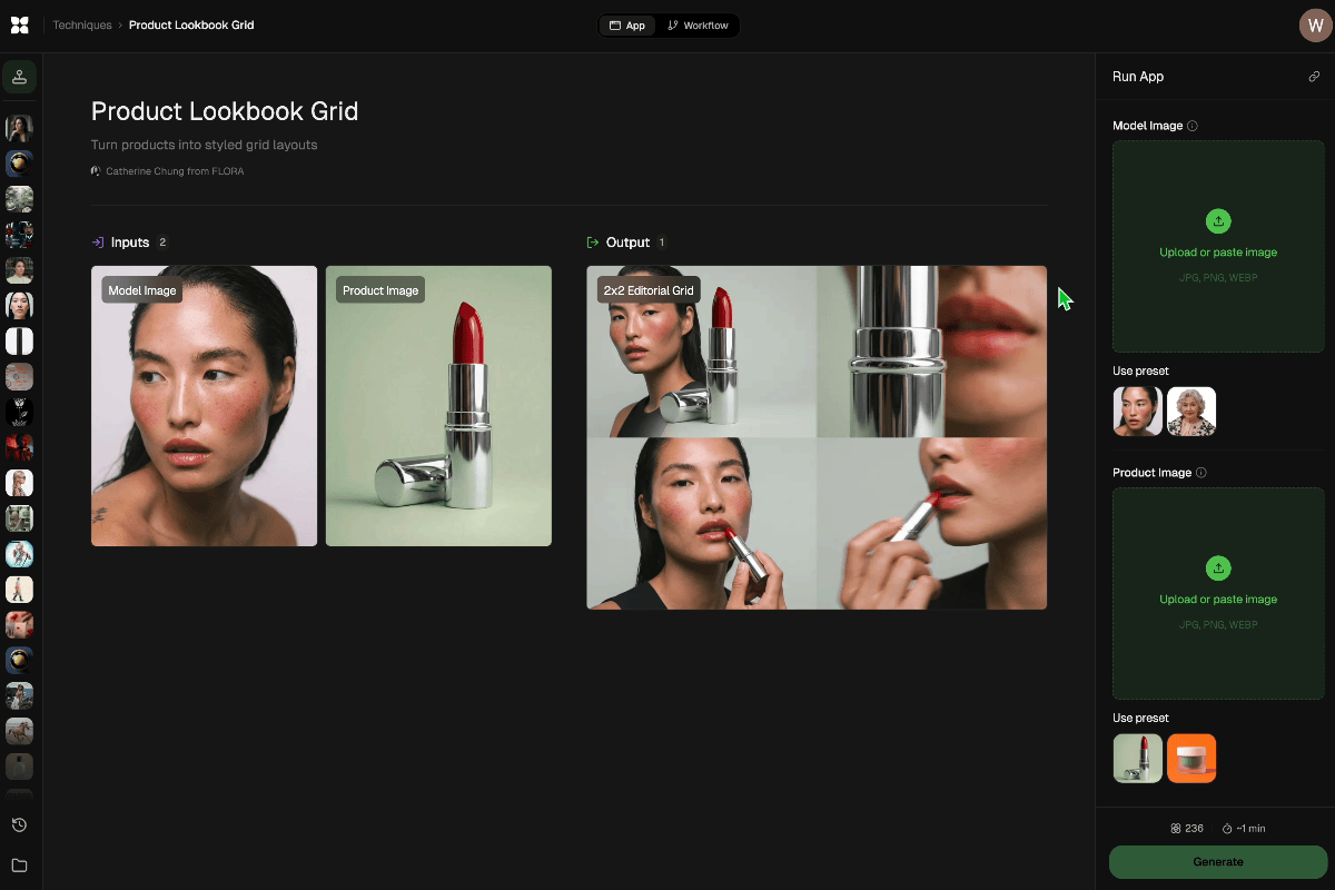
Run this AI-powered technique in your browser. Upload your inputs, hit generate, and get professional results in moments.

Creative Production
Design teams use FLORA techniques to produce professional-quality creative assets in seconds, accelerating production timelines and reducing dependency on manual editing.

Marketing Content
Marketing teams generate on-brand visual content for campaigns, social media, and ads — iterating quickly on concepts without waiting for design resources.

Product Visualization
E-commerce and product teams create high-quality product visuals, mockups, and lifestyle imagery to showcase their offerings across channels.
How to use Techniques?
Discover how to utilize DISRUPT for different scenarios.
Add inputs
Upload images, videos, or type in the prompts to get started.
Generate outputs
Next, hit the "Generate" button to start generating your outputs.
Edit and export
Refine your outputs on canvas, or download them directly.
Frequently asked questions
All you need to know about DISRUPT
DISRUPT
Upload any product. Identify 5 category traps. Build 3 escape routes. Execute all routes with full campaign context. Synthesize into one launch film. Strategy-first brand disruption.

Om Shukla