Billboard Design
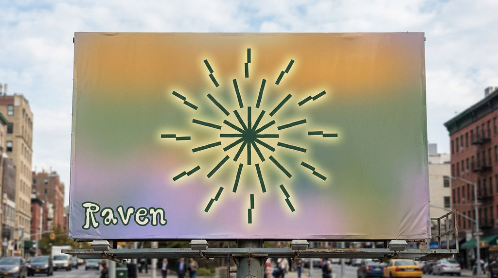
BILLBOARD CREATIVE BRIEF — RAVEN --- CONCEPT TITLE: The Burst One image. One moment. Pure energy. --- OVERVIEW The billboard is a landscape of stillness interrupted by an explosion of light. The starburst icon owns the canvas — raw, radiant, and unapologetic. Everything else whispers so it can shout. --- LAYOUT & COMPOSITION - Background: A soft, full-bleed gradient pulled directly from the color palette — warm golden amber bleeding into muted sage green, drifting down into a hazy lavender at the base. It reads like a sunset through frosted glass. - Icon placement: Dead center. Large. The starburst fills roughly 60% of the billboard height. Its segmented rays feel kinetic — like it just detonated. Render it in deep forest green (from the palette) so it anchors into the gradient without disappearing. - Icon treatment: Give the icon a subtle aura — a soft glow or faint halo using the warm yellow-green from the palette, as if the burst is radiating outward into the background. - Typography placement: The word Raven sits quietly in the lower-left corner, set small relative to the icon — roughly 10–12% of the billboard height. It uses the chunky outlined Raven typeface in deep forest green on the pale cream tone, lending warmth without competing. - Negative space: Generous. Let the gradient breathe around the icon. Resist the urge to fill. --- TONE & FEEL - Organic yet electric - Retro-cosmic — like a 70s poster meets a night sky - Confident without being loud --- COLOR ROLES - Amber-gold: Background anchor, top zone - Sage green: Mid-gradient transition, icon fill - Lavender: Background base, grounding the composition - Cream: Typography counter color, brings warmth to the lettering - Deep forest green: Icon and wordmark — the brand's backbone --- TYPOGRAPHY DIRECTION - Use Raven typeface for the wordmark only - No tagline, no supporting copy — the icon earns the silence - If a URL or handle is required, set it in the smallest weight possible, bottom-right corner, cream-colored --- KEY DESIGN PRINCIPLE The icon is the message. The palette is the mood. The type is the signature. In that order, always.
Run this AI-powered technique in your browser. Upload your inputs, hit generate, and get professional results in moments.
Creative Production
Design teams use FLORA techniques to produce professional-quality creative assets in seconds, accelerating production timelines and reducing dependency on manual editing.
Marketing Content
Marketing teams generate on-brand visual content for campaigns, social media, and ads — iterating quickly on concepts without waiting for design resources.
Product Visualization
E-commerce and product teams create high-quality product visuals, mockups, and lifestyle imagery to showcase their offerings across channels.
How to use Techniques?
Discover how to utilize Brand extension.,.. for different scenarios.
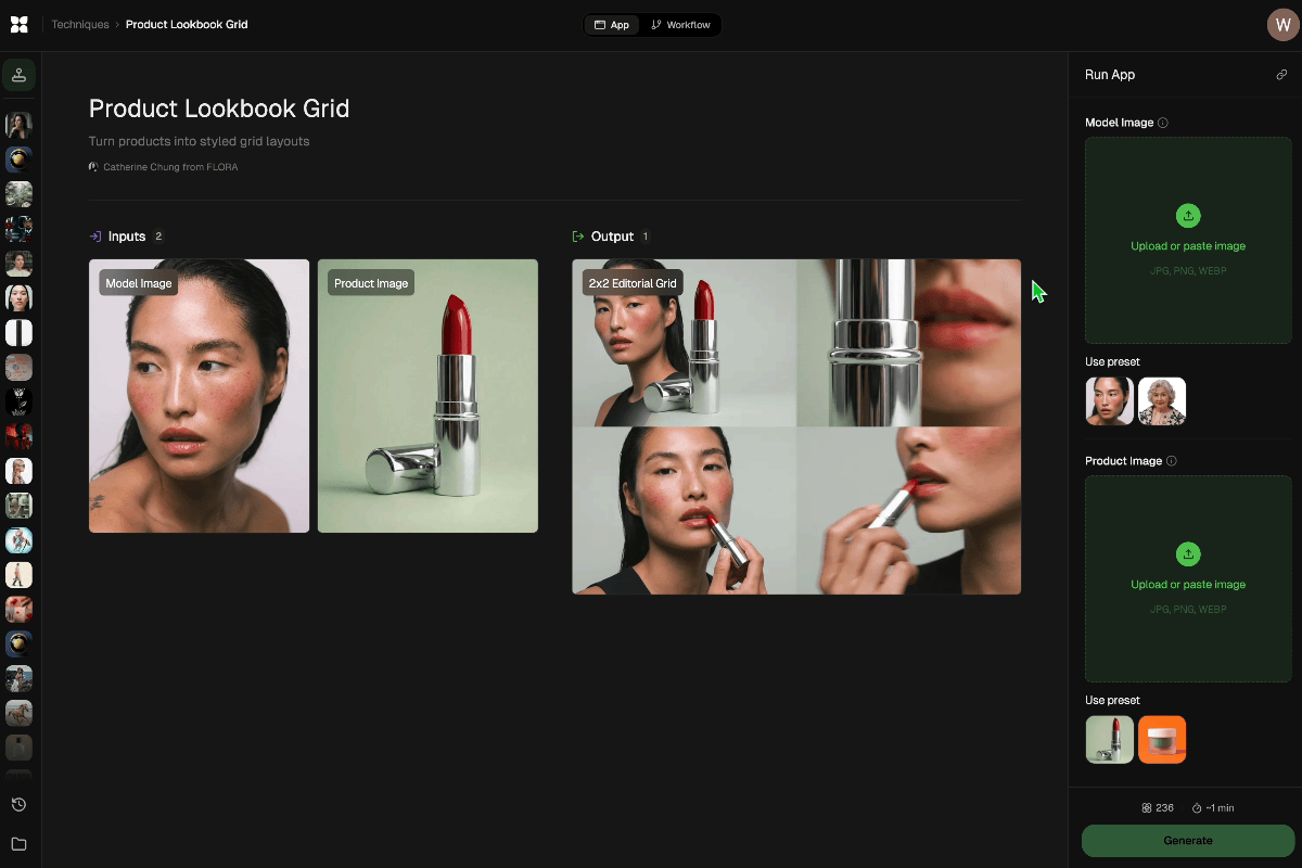
Add inputs
Upload images, videos, or type in the prompts to get started.
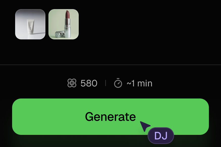
Generate outputs
Next, hit the "Generate" button to start generating your outputs.
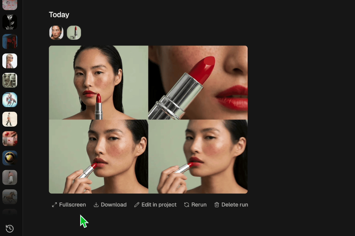
Edit and export
Refine your outputs on canvas, or download them directly.
Frequently asked questions
All you need to know about Brand extension.,..
Brand extension.,..
xxxx

Tarshaa Krishnaraj
