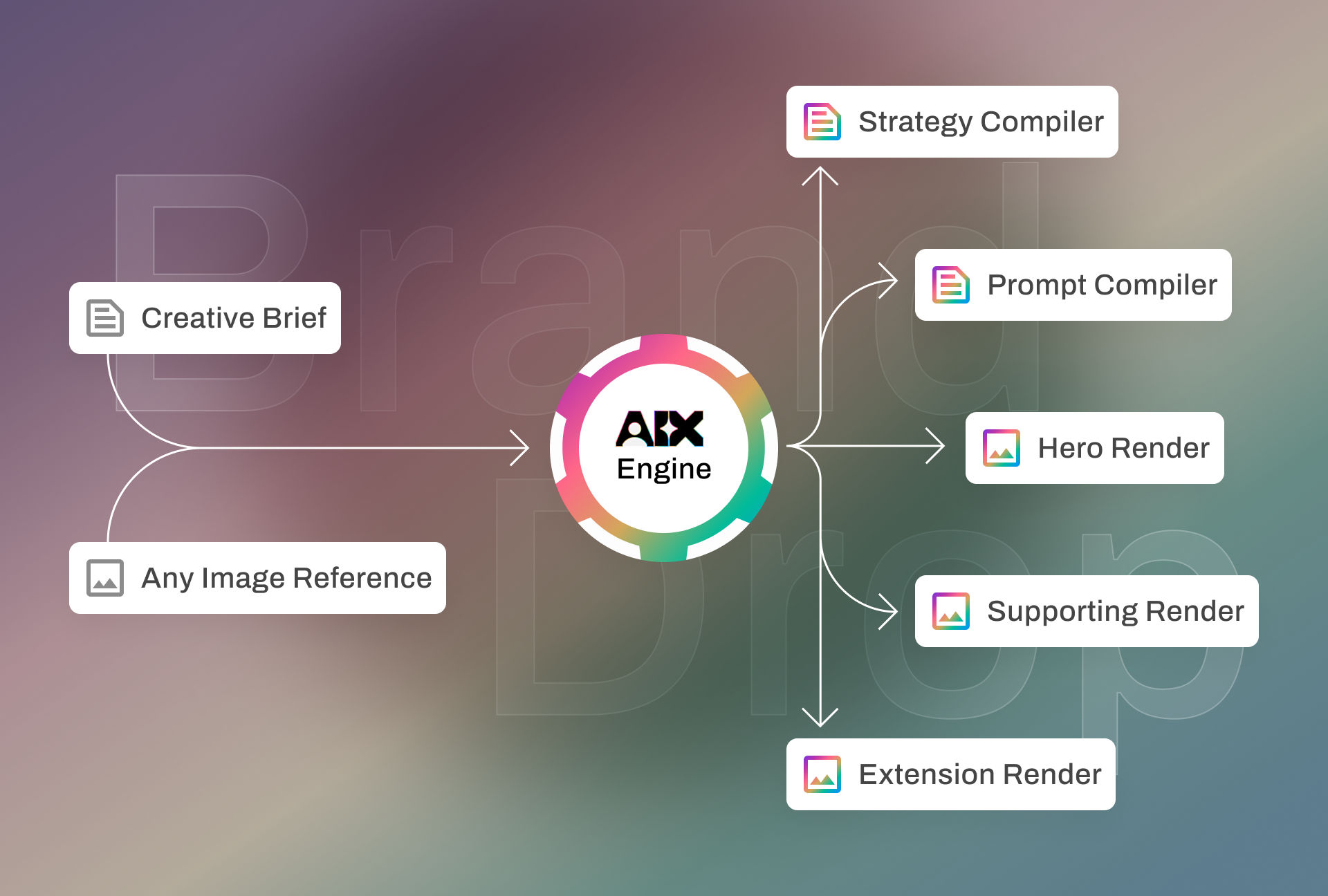
Creative Brief Prompt
Streetwear brand dropping our first sneaker collab. The vibe is Tokyo meets Lagos — clean but loud, urban raw with studio precision. Need the full visual playbook from Instagram teasers to pop-up shop signage. We want to own the intersection of street culture and athletic performance.
Strategy Compiler
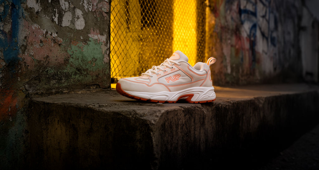
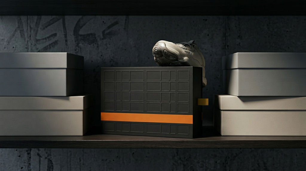
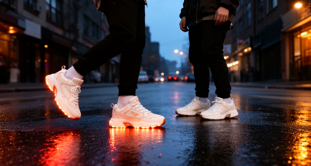
PROJECT SUMMARY Based on your brief, you are approaching this as a Client commissioning a full visual identity and campaign system for a debut sneaker collaboration. The primary objective is to launch a culturally dual-coded streetwear product — fusing Tokyo minimalism with Lagos maximalism — establishing brand equity from zero across Instagram teaser content and physical pop-up signage, with a visual playbook governing all future expression. BRAND POSITIONING Brand essence: Raw precision meets cultural thunder Core emotion: Electric recognition — the feeling of seeing yourself represented without compromise Positioning statement: The first sneaker born where disciplined East Asian craft collides with West African expressive energy, built for the generation that moves between both worlds fluently. Whitespace opportunity: Most streetwear collabs borrow from one cultural register and gesture toward the other. This brand occupies the actual intersection — not aesthetically borrowing but structurally building from both. The chunky athletic silhouette from the reference image already carries retro-performance credibility; the graffiti environment signals urban authenticity. Neither Tokyo nor Lagos — both simultaneously. VISUAL SYSTEM Primary color: #1A1A1A — a deeper, warmer black pulled from the asphalt shadow in the reference. Dominates backgrounds, pop-up walls, and full-bleed social frames. More intentional than the #2C2C2C in the source — this reads as studio-grade darkness. Secondary color: #D46A1A — the burnt orange directly from the sneaker outsole and branding accents. This is the cultural heat signal. Use on typographic highlights, border treatments, and structural dividers. It bridges product and environment. Accent color: #F0C040 — pushed warmer and more saturated than the #E8A838 graffiti yellow in the source. This is your energy moment color: CTAs, drop countdown numbers, flash sale tags, neon signage at pop-up. Lagos maximalism lives here. Neutral color: #F5F0EB — the off-white of the sneaker upper becomes the brand's breath. Body text on dark backgrounds, product callout cards, negative space in layouts. It keeps the system from reading as aggressive. Typography direction: Dual-axis system. A compressed, high-weight display sans-serif for headlines — think wide tracking at large sizes, brutalist confidence. Pair with a clean geometric sans at regular weight for body and captions. Zero serifs. The tension between tight-set display type and open utility text mirrors the Tokyo-Lagos duality. Spacing should feel intentional, not generous. Composition philosophy: Structured asymmetry. Dense at the focal point, releasing into negative space at the edges. Inspired by the staggered two-shoe arrangement in the reference — energy implied through imbalance, not chaos. Pop-up signage should use grid-locked layouts that feel precise; Instagram content breaks the grid deliberately on hero frames only. Photography direction: Dramatic directional lighting matching the reference — single strong source isolating product against dark environments. Subjects (if lifestyle) shot low-angle, mid-action or arrested motion. Environments should layer concrete, mesh, and painted surfaces without becoming generic. Skin tones across both cultural references should be lit with equal intentionality — no defaulting to one as primary. EXECUTION ROADMAP 1. Immediate first action: Lock the two missing anchors — confirm the collab partner's existing visual language and finalize the sneaker colorway. Every downstream decision branches from these. Without them, you are approving direction concepts, not a resolved system. 2. Foundation building this week: Brief your creative team using this document as the strategic framework. Commission three distinct mood board directions — each honoring both cultural references differently. Use the visual system above as the bounding rules, not the creative answer. 3. Refinement and testing: Test the visual system at actual output sizes — Instagram 1080x1080, story format 1080x1920, and a printed A1 pop-up panel. Color and type decisions that work in decks often fail at physical scale. Orange on black needs contrast-ratio verification for signage legibility. 4. Deployment or handoff: Deliver the approved visual playbook as a living document — color tokens, type scales, composition rules, and photography brief — before any production begins. This is your brand's first touchpoint. Consistency now builds the equity you'll spend later. ROLE-SPECIFIC GUIDANCE As the client, your most important job right now is not approving visuals — it is filling the information gaps identified above. The collab partner's identity and the product colorway are not details; they are load-bearing walls. Share them with your creative team before the first concept round, not after. When evaluating creative work, use the positioning statement as your filter: does this feel like raw precision meeting cultural thunder? If a direction reads as one cultural reference with a nod to the other, push back. The brief is explicit about owning the intersection, not visiting it. For approval criteria on the Instagram teaser series: each asset should work without context — a viewer unfamiliar with the collab should feel the cultural energy and want to know more. Pop-up signage should be legible at 10 meters and still feel designed at arm's length. ASSUMPTIONS AND WARNINGS - Assumed target audience is 18–30, globally diaspora-aware, sneakerhead-adjacent. Confirm before media buying. - The FLIP wordmark from the reference image cannot be reproduced accurately by AI generation tools. All generated concepts are directional only — logo must be applied in post-production. - Graffiti and texture elements in AI outputs will hallucinate. Treat as mood reference, not final art. - No campaign timeline was provided. Teaser-to-drop sequencing will need a separate brief phase before Instagram content is produced. - This is a debut collab — brand recognition is zero. Every asset must work as both an introduction and a statement simultaneously.
Prompt Compiler
FLIP SNEAKER COLLAB — AI PROMPT TOOLKIT Tokyo x Lagos | Clean But Loud | Urban Raw x Studio Precision --- DESIGNER PROMPTS 1. Brand Identity Exploration Generate a visual identity system board for a Tokyo-meets-Lagos streetwear sneaker brand using a palette of off-white (#F5F0EB), burnt orange (#D46A1A), dark asphalt (#2C2C2C), and yellow graffiti (#E8A838). Show logo placement zones, color application across backgrounds, and type hierarchy that balances East Asian minimalism with West African maximalist energy. Include one horizontal lockup, one stacked lockup, and one icon-only mark. Ultra-sharp, editorial layout, studio precision, high-resolution identity board. 2. Typography Pairing Generate a typographic specimen sheet showing 3 font pairings for a streetwear-athletic sneaker brand positioned at the intersection of Tokyo precision and Lagos energy. Each pairing must include a bold display headline, a mid-weight subheading, and a clean body copy block set in off-white on dark asphalt (#2C2C2C) and reversed. Pairings should range from compressed grotesque to expressive display. Specimen sheet format, brand typography reference, print-ready quality, high contrast. 3. Color System Expansion Generate an extended color palette board expanding from the core brand colors: off-white (#F5F0EB), burnt orange (#D46A1A), dark asphalt (#2C2C2C), yellow graffiti (#E8A838), and slate blue (#5B8FA8). Show each hue with 5 tints and 3 shades, usage context labels (hero background, accent, CTA, text), and pairing swatches demonstrating contrast. Raw yet refined aesthetic, streetwear brand color system, design reference sheet, ultra-clean layout. 4. Layout System Generate a layout and grid system reference board showing how this streetwear sneaker brand arranges visual elements across a vertical poster (27x40), a square Instagram post (1:1), and a wide web banner (16:9). Each format should demonstrate asymmetric composition, high contrast between off-white product zones and asphalt-dark backgrounds, with burnt orange as a tension element. Clean but loud visual rhythm, studio-precise alignment, brand layout reference, editorial design quality. 5. Supporting Graphics Generate a sheet of supporting graphic elements for a Tokyo-Lagos sneaker brand — including a concrete texture overlay, a thin-line geometric pattern referencing both grid-based Japanese design and Adire/Ankara structural motifs, and a grunge ink splatter brush mark in burnt orange (#D46A1A) on off-white. Elements should feel street-authentic but designed with studio precision. Layerable assets, brand texture system, raw-meets-refined aesthetic, high-resolution vector-adjacent quality. --- MARKETER PROMPTS 6. Campaign Hero Generate a campaign hero key visual for a debut sneaker collab launch: a chunky off-white and burnt orange sneaker with a retro late-90s silhouette floats against a dark asphalt background with subtle graffiti-tagged concrete texture. Dramatic low-angle directional lighting isolates the product. A bold compressed headline zone sits in the upper third, empty for text overlay. Clean but loud, Tokyo-Lagos street energy, high-impact launch visual, cinematic product photography aesthetic, ultra-sharp. 7. Social Media Suite Generate a 2x2 grid of Instagram post mockups for a streetwear sneaker collab brand using off-white, burnt orange, and dark asphalt palette. Top-left: isolated product feature on concrete with dramatic side lighting. Top-right: lifestyle shot of a young urban person wearing the sneaker in a Tokyo backstreet at dusk. Bottom-left: bold testimonial card with quote text over asphalt texture and orange accent bar. Bottom-right: drop announcement graphic with countdown typographic treatment. Cohesive grid, raw-precision aesthetic, social-ready, high-resolution. 8. Ad Creative Generate a performance ad visual for a sneaker drop: the chunky off-white and burnt orange sneaker is prominent in the foreground, shot from a low angle against a dark urban background. A burnt orange CTA button zone sits in the lower right, with a clear headline value proposition block in the upper left using compressed bold typography. Designed for a 1080x1080 Instagram feed ad format. Immediate visual impact, product-forward, conversion-optimized layout, streetwear energy, studio lighting quality. 9. Email Header Generate a horizontal email newsletter hero banner (600x200px proportions) for a streetwear sneaker brand. The off-white and burnt orange sneaker sits right-aligned against a dark asphalt gradient background. The left two-thirds of the banner is intentionally open for headline text overlay in off-white and burnt orange type. Subtle graffiti texture watermarks the background at low opacity. Clean but loud, editorial email design, brand-consistent palette, high-resolution digital asset. 10. Landing Page Hero Generate an above-the-fold website hero section for a sneaker collab launch page: the chunky retro silhouette in off-white and burnt orange is shown in context on an urban concrete surface with dramatic directional light. A large open headline zone occupies the left column in dark asphalt, with a burnt orange CTA button below. The overall composition uses asymmetric tension between product and type zones. Tokyo-Lagos street aesthetic, web layout proportions 1440px wide, clean but loud, studio precision. --- DEVELOPER PROMPTS 11. Design Token Reference Generate a visual design token reference sheet for a streetwear sneaker brand. Show color swatches with hex codes for off-white (#F5F0EB), burnt orange (#D46A1A), dark asphalt (#2C2C2C), graffiti yellow (#E8A838), and slate blue (#5B8FA8). Include a spacing scale from 4px to 64px, border radius options from 0 to 12px (reflecting the brand's balance of angular street graphics and rounded product forms), and 3 shadow definitions. Technical reference format, design system documentation aesthetic, clean grid layout, developer-ready. 12. Component Visual Reference Generate a UI component reference sheet for a sneaker brand's digital experience showing buttons (primary in burnt orange, secondary in off-white outline, ghost), product cards with dark asphalt background and orange accent tag, text input fields, and a navigation bar in both light (off-white) and dark (asphalt) variants. All components should reflect the brand's urban-raw-meets-studio-precision aesthetic — slightly bold, high contrast, minimal decoration. Design system component sheet, light and dark mode, streetwear digital brand, sharp reference quality. 13. Responsive Layout Reference Generate a side-by-side responsive layout reference showing the sneaker brand's product page at mobile (375px), tablet (768px), and desktop (1440px) breakpoints. Each viewport shows the chunky sneaker product image, a headline zone in compressed bold type, and a burnt orange CTA button adapting its position and scale. The dark asphalt background and off-white product zone remain consistent across breakpoints. Responsive design reference, brand-consistent layout adaptation, developer handoff quality, clean annotated format. 14. Dark Mode Variant Generate a dark mode brand reference sheet for the sneaker collab's digital presence showing how the palette inverts while maintaining brand recognition: deep asphalt (#2C2C2C) as primary background, off-white (#F5F0EB) as primary text, burnt orange (#D46A1A) holding as the accent throughout. Show a product card, a headline text block, a CTA button, and an icon set in dark mode. Urban-raw mood preserved, high contrast maintained, brand-consistent dark theme, digital UI reference quality. 15. Accessibility Check Generate a visual accessibility audit reference card for the streetwear sneaker brand showing 6 foreground-background color combinations: off-white on asphalt, orange on asphalt, asphalt on off-white, yellow on asphalt, blue on asphalt, and orange on off-white. Each combination shows a sample headline and body text block with a contrast ratio indicator (pass/fail for WCAG AA). Brand color system, accessibility compliance reference, clean grid layout, design system documentation quality. --- CREATIVE DIRECTOR PROMPTS 16. Concept Board Generate a concept board showing 3 distinct creative territories for the Tokyo-Lagos sneaker collab campaign. Territory 1: minimal Japanese editorial — sparse white space, ink-precise product photography, haiku-length copy zones. Territory 2: Lagos market energy — dense color layering, Ankara-inspired geometric pattern overlays, bold Pidgin-inflected typographic attitude. Territory 3: athletic tunnel vision — motion blur, performance focus, dark corridor lighting with the sneaker as the singular light source. Three panels side by side, creative direction exploration, art director reference board, high concept. 17. Art Direction Variations Generate 3 side-by-side product shots of the same chunky off-white and burnt orange sneaker treated with dramatically different art direction. Shot 1: Tokyo studio — pure white infinity cove, precise shadow, clinical lighting, architectural composition. Shot 2: Lagos street — golden-hour sunlight on cracked asphalt, graffiti-covered wall, high saturation, kinetic energy. Shot 3: Athletic dark room — jet-black background, single spotlight, motion-freeze technique, aggressive low angle. Same silhouette, three worlds, art direction comparison, campaign creative exploration. 18. Pitch Deck Visual Generate a single presentation-ready slide visual for a CMO pitch introducing the Tokyo-meets-Lagos sneaker collab brand. A cinematic wide-format composition (16:9) shows the product in dramatic directional lighting against a dark asphalt background, with a clear left-zone for a brand positioning statement in compressed white type. The burnt orange accent pulls the eye from the sneaker sole to the headline. Executive presentation quality, brand vision communication, confident and resolved, no clutter, premium streetwear aesthetic. 19. Campaign Narrative Generate 4 sequential frames telling the brand story arc for the sneaker collab campaign. Frame 1 (Problem): a lone figure in a generic urban landscape, desaturated, unbranded, anonymous. Frame 2 (Solution): the off-white and burnt orange sneaker drops into frame — color floods in, graffiti activates around it. Frame 3 (Transformation): the figure wears the sneaker, mid-stride, Tokyo street at dusk meeting Lagos market energy in the background. Frame 4 (Aspiration): wide shot of a diverse crew owning the intersection of two cities, the sneaker centered. Four frames, storyboard format, campaign narrative sequence, cinematic quality. 20. Client Presentation Generate a before-and-after visual pair for a creative director presentation showing brand elevation. Left panel (before): the sneaker photographed on a plain white background with flat lighting — generic, forgettable, category-standard. Right panel (after): the same sneaker shot with dramatic directional lighting on graffiti-tagged asphalt, dark asphalt background, burnt orange practical light source, asymmetric composition. Side-by-side format, brand direction elevation demonstration, creative presentation quality, clean comparison layout. --- CLIENT PROMPTS 21. Brief Visualization Generate a single reference image capturing the exact feeling of this brand brief: clean but loud, urban raw, studio precision, Tokyo meets Lagos. A chunky off-white sneaker with burnt orange sole sits on cracked urban concrete under a dramatic directional studio light. Behind it, faint graffiti in yellow and slate blue bleeds through a near-black background. The image feels like a fashion editorial shot in a street alley. Mood reference, creative brief visualization, high impact, restrained chaos, directional quality. 22. Competitor Positioning Generate a visual comparison showing 3 brand aesthetic positions in a single reference sheet. Position A (this brand): off-white and burnt orange sneaker, raw concrete setting, dramatic lighting, Tokyo-Lagos cultural fusion energy, clean but loud. Position B (competitor 1): a clean minimal Scandinavian-influenced sneaker brand aesthetic — pure white, airy, lifestyle-soft. Position C (competitor 2): an aggressive hype streetwear brand — black dominant, logo-heavy, maximalist layering. Three panels, visual market positioning map, brand differentiation reference, category overview quality. 23. Audience Persona Generate a lifestyle image representing the target audience for this sneaker collab: a young person, early 20s, culturally fluent, dressed in a mix of Tokyo and Lagos-influenced streetwear — relaxed technical outerwear, layered textures, the off-white and burnt orange sneaker prominent on-foot. Setting: a city overpass at golden hour, somewhere between Asia and West Africa in visual language. Candid editorial feel, authentic street energy, sneakerhead-adjacent lifestyle, not posed, natural confidence, cinematic grain. 24. Brand Values Generate 3 separate images each representing one brand value as a visual metaphor. Image 1 (Duality): a split-composition frame — one half spare Tokyo minimalism in cool tones, one half Lagos market maximalism in warm tones, the sneaker at the seam. Image 2 (Precision): extreme macro close-up of the burnt orange stitching detail on the sneaker upper — obsessive craft, controlled execution. Image 3 (Authenticity): the sneaker on a cracked Lagos roadside asphalt with a Danfo bus blurred in background — unglamourized, real, earned. Three images, brand values visual series, conceptual photography quality, editorial art direction. 25. Approval Reference Generate a yes-this / not-this visual reference pair for the client. Left panel (YES): the off-white and burnt orange sneaker in a raw concrete environment with dramatic single-source lighting, asymmetric composition, graffiti texture in the deep background, restrained but energized — clean but loud. Right panel (NOT THIS): the same product overproduced — too many graphic overlays, neon color contamination, generic hype-brand lens flare, cluttered layout, cultural references flattened into stereotype. Side-by-side format, creative direction guardrails, client alignment reference, clear and decisive visual communication.
Run this AI-powered technique in your browser. Upload your inputs, hit generate, and get professional results in moments.

Creative Production
Design teams use FLORA techniques to produce professional-quality creative assets in seconds, accelerating production timelines and reducing dependency on manual editing.

Marketing Content
Marketing teams generate on-brand visual content for campaigns, social media, and ads — iterating quickly on concepts without waiting for design resources.

Product Visualization
E-commerce and product teams create high-quality product visuals, mockups, and lifestyle imagery to showcase their offerings across channels.
How to use Techniques?
Discover how to utilize Brand Engine for different scenarios.
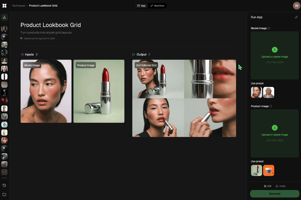
Add inputs
Upload images, videos, or type in the prompts to get started.
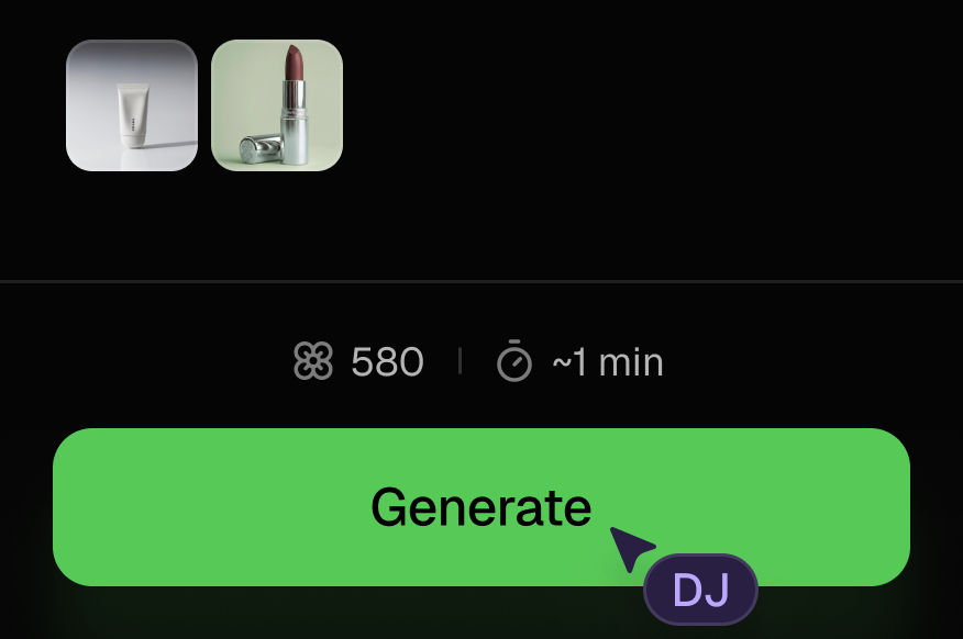
Generate outputs
Next, hit the "Generate" button to start generating your outputs.
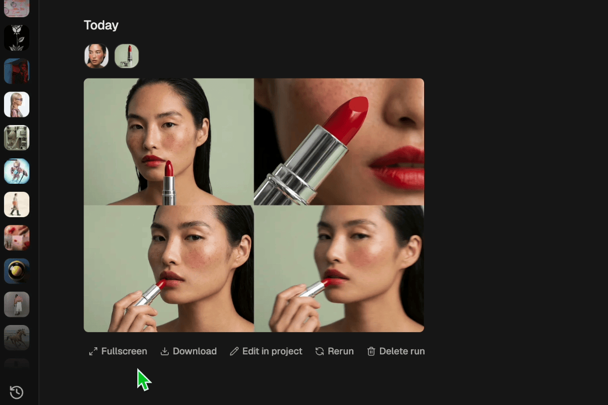
Edit and export
Refine your outputs on canvas, or download them directly.
Frequently asked questions
All you need to know about Brand Engine
Brand Engine
Powered by AIX Compiler. Upload any brand asset, describe what you need. Get a strategic roadmap, 25 copy-paste prompts for 5 roles, and 3 adaptive campaign visuals. It thinks first.

Syed Shahab