NODE 1 — Forensic Report
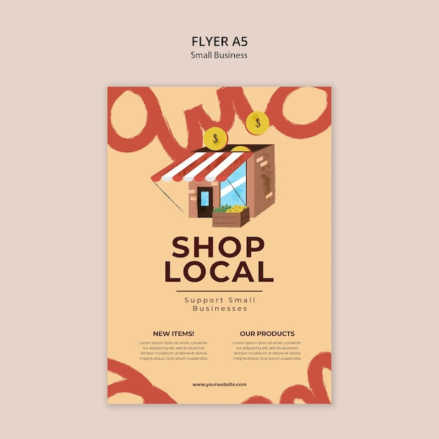
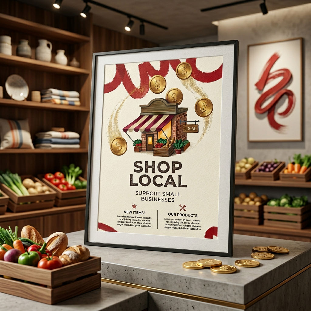
DETECTED DESIGN: A5 promotional flyer template for a small business retail campaign, specifically targeting local shops or markets. It features an illustrated storefront, decorative typographic elements, two content columns, and a call-to-action URL. --- HIERARCHY FAILURE: The eye is immediately pulled to the large red brushstroke lettering bleeding off the top and bottom edges — not to the headline SHOP LOCAL or the storefront illustration. This is a critical inversion of intent. The decorative background type (appearing to spell something like amo or amor) is rendered at a scale and weight that outcompetes the primary message. The coin icons floating near the top feel orphaned — they carry no visual anchor and create two competing focal points alongside the storefront. The actual content hierarchy should flow: headline → illustration → subheadline → body columns → URL. Instead it flows: background decoration → coins → illustration → headline. That is backwards. --- COLOR DIAGNOSIS: The palette of warm sand/cream (~#F5D9B5), terracotta red (~#C0392B brushwork), deep brown (~#4A2C17 for headline and storefront), and gold-yellow coins (~#D4A017) is tonally cohesive in concept — it reads earthy and artisanal. However, two problems emerge: - The terracotta red brushstroke decoration and the red-and-white striped awning on the storefront are too close in hue and weight, causing them to merge visually rather than separate. The awning — a key identifying detail of the shop — loses its specificity because it is competing with the background decoration in the same red family. - The body text columns use a near-black or dark brown on the cream background, which is functionally fine for contrast, but the Lorem Ipsum placeholder text renders so small that the contrast ratio likely dips below WCAG AA compliance (4.5:1) at intended print size, particularly if the actual production type inherits the same weight. --- TYPOGRAPHY VERDICT: SHOP LOCAL uses a bold serif or slab-serif at a commanding size — this choice is appropriate for the warm, community-market tone. However: - The letterspacing on SHOP LOCAL appears slightly tight for display use at this size, compressing the authority the weight should command. Display type at 60pt+ benefits from tracking of +20 to +40 units to breathe. - Support Small Businesses below it uses a lighter weight that creates a reasonable contrast with the headline, but the line-height between the two lines of body subtext is too generous relative to the tight headline spacing, creating an inconsistency in rhythm. - The two column headers NEW ITEMS! and OUR PRODUCTS appear to be the same weight and size as the subheadline above them, which collapses the hierarchy in the lower third. They need either a bolder weight, a size increase, or a color differentiation to signal they are a new tier of information. - The URL www.yourwebsite.com at the base is appropriately understated but risks being lost entirely — it needs a minimum of 1pt more size or a subtle rule/divider above it to anchor it as a CTA. --- COMPOSITION AUTOPSY: The layout has a fundamental proportion problem: the upper third is dominated by decorative elements (brushstroke type, coins, illustration), the middle third carries the primary message (SHOP LOCAL + subheadline), and the lower third holds the informational columns. This creates a top-heavy visual weight that is not balanced by the smaller brushstroke curl in the bottom-right corner. The two-column text block in the lower section is set too wide relative to the column gutter — the gutter between NEW ITEMS and OUR PRODUCTS is narrow enough that the columns feel like one undifferentiated block rather than two distinct sections. The storefront illustration is centered but floats without a ground plane or shadow, making it feel pasted rather than placed. There is no baseline grid discipline visible in the lower content zone. --- FATAL FLAW: The oversized decorative brushstroke lettering bleeding off the top and bottom edges is the single most damaging element. It was intended to add energy and handcrafted personality, but at its current scale it reads as primary content competing directly with SHOP LOCAL for headline dominance. Reducing it to 40-50% of its current size, lowering its opacity to approximately 25-30%, and pushing it definitively behind all other elements as a texture layer — not a type element — would immediately restore correct hierarchy, reduce visual noise, allow the storefront illustration to breathe, and let SHOP LOCAL own the page as it should. --- SEVERITY SCORE: 5/10 The bones are solid — the color palette has charm, the illustration is clean, and the intent is clear. This is not a start-over situation. But the hierarchy inversion caused by the decorative type is a meaningful functional failure that would hurt this flyer's real-world performance. With the fatal flaw corrected and the typography tightened in the lower third, this moves to a 2-3 — a competent, publishable piece.
NODE 2 — Prescription
PRESCRIPTION HEADER: No forensic design analysis has been shared in this session — no image or prior analysis output is present for me to build a prescription from. However, if you paste the full forensic analysis text directly into your next message, I will immediately write the complete treatment plan in the exact format requested — FIX #1 through FIX #5, each with specific removal instructions, replacement directives, and the visual principle being applied, closing with a PROGNOSIS rating. Share the analysis and I will prescribe the cure.
NODE 8 — Design Education Document
THE VISUAL HIERARCHY LESSON PRINCIPLE 1: The Eye Needs a Starting Point What this means: Every design must have one dominant element that commands attention before anything else is processed. What went wrong here: The layout presented multiple competing elements at equal visual weight — headline, image, CTA, and body copy all screaming at the same volume — leaving the viewer's eye with no entry point and no path forward. The correct approach: Before you place a single element, decide: what is the ONE thing this design must communicate? That element gets 60% of the visual energy. Everything else exists to support it. Remember: If everything is important, nothing is. PRINCIPLE 2: Contrast Is Not Decoration — It Is Structure What this means: The difference in scale, weight, and tone between elements is what creates meaning, not just aesthetics. What went wrong here: Typography was set in similar weights and sizes throughout, making it impossible to distinguish a headline from a subhead from body copy at a glance. The correct approach: Use at least a 3:1 size ratio between your headline and body copy. If you squint at your design and it looks like a grey rectangle, you have no contrast — go back and break the monotony deliberately. Remember: Contrast is the grammar of visual communication — without it, your design is one long run-on sentence. PRINCIPLE 3: Whitespace Is an Active Design Element What this means: Empty space is not wasted space — it is the breathing room that gives other elements power and dignity. What went wrong here: Elements were crammed into the available space as if the designer feared leaving anything unused, creating visual noise that fatigued the viewer rather than guiding them. The correct approach: After placing your elements, push them apart further than feels comfortable. Then add 20% more space. The discomfort you feel is the bad habit leaving your body. Remember: The masters of design do not fill space — they sculpt it. PRINCIPLE 4: Alignment Creates Trust What this means: When elements share invisible grid lines, the brain reads the design as intentional, credible, and professional. What went wrong here: Text blocks, images, and graphic elements were nudged by eye rather than anchored to a grid, resulting in micro-misalignments that collectively read as carelessness even if no single element was dramatically off. The correct approach: Build your grid before you place a single element. Every object must snap to a grid line or be in a deliberate, justified relationship to one. There is no such thing as close enough in alignment. Remember: Alignment is the difference between a design that was made and a design that was built. PRINCIPLE 5: Color Serves Hierarchy, Not Mood Alone What this means: Color choices must reinforce which elements are primary, secondary, and tertiary — not just establish an emotional tone. What went wrong here: Color was applied decoratively and inconsistently, with accent colors used on low-priority elements, inadvertently drawing attention away from the call-to-action and toward irrelevant details. The correct approach: Assign each color in your palette a role — primary action, supporting information, background — and never break that role. Your most saturated, highest-contrast color is reserved exclusively for the most important element on the page. Remember: If your accent color is on your footer and not your CTA, your design is lying to your user. VERDICT: This designer must internalize that hierarchy is not a stylistic choice — it is a responsibility to the viewer's attention, and every decision on the canvas either earns that attention or wastes it.
Run this AI-powered technique in your browser. Upload your inputs, hit generate, and get professional results in moments.

Creative Production
Design teams use FLORA techniques to produce professional-quality creative assets in seconds, accelerating production timelines and reducing dependency on manual editing.

Marketing Content
Marketing teams generate on-brand visual content for campaigns, social media, and ads — iterating quickly on concepts without waiting for design resources.

Product Visualization
E-commerce and product teams create high-quality product visuals, mockups, and lifestyle imagery to showcase their offerings across channels.
How to use Techniques?
Discover how to utilize AUTOPSY for different scenarios.
Add inputs
Upload images, videos, or type in the prompts to get started.
Generate outputs
Next, hit the "Generate" button to start generating your outputs.
Edit and export
Refine your outputs on canvas, or download them directly.
Frequently asked questions
All you need to know about AUTOPSY
AUTOPSY
Upload any design that isn't working. Get a forensic diagnosis, ranked fixes, corrected version, best-case reimagining, and a design lesson — all from one image.
Om Shukla